Summary / TL;DR
Creating infographics involves a structured five-step process designed to simplify complex data into engaging visuals. First, designers plan the content and set an appropriate tone using custom colour schemes rooted in colour psychology. Typography, iconography, and consistent branding—such as placing logos and adding a call to action—further support clarity and recognition. The fourth step emphasises storytelling balanced with accurate data sources, ensuring the information is both reliable and contextually clear. Finally, understanding the target audience guides tone, complexity, and content selection. Well-designed infographics enhance brand visibility, audience engagement, and SEO by combining informative content with visual appeal.
Sharing complex data with your audience can be tricky. Yet, by using the right approach, you can simplify it into easily digestible steps, leveraging images to convey the message effectively.
It may also be difficult for people to navigate statistics lines; this is where infographics are an excellent solution.
Infographics have become popular with businesses and organisations, both in print and online. They’re an artistic yet effective tool for presenting information that captures attention.

They also allow people to digest information easily using visual data. With the proper use of information, colour and proportion, they can be transformed into attention-grabbing, persuasive, and memorable data visualisations.
In this article, we will explain five steps to make an infographic that stands out.
What Is An Infographic? An Overview
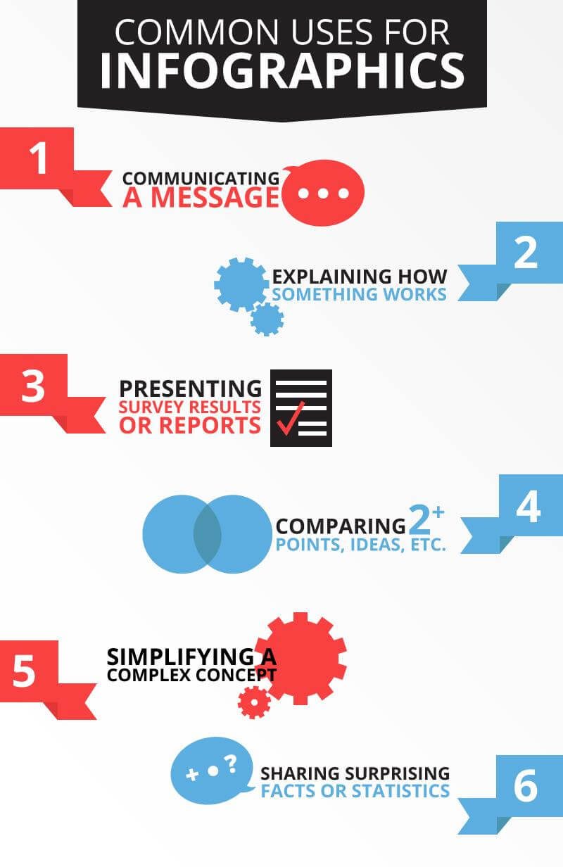
An infographic is a tool for crafting beautiful visual representations of data. It seamlessly combines various elements, such as text, images, and charts, including pie charts and diagrams, to convey information effectively.
It presents data such as survey results and explains complex issues in a way that can easily lead to a better understanding.

Set A Plan
The first challenge you may encounter when you are new to infographic design is that creating one may take around 30 minutes or more. Although it is easier to do a Google Search and share it online after creation instead of using others’ graphics, the importance of creating your own infographic can’t be overstated in today’s visual internet.
Infographics are a fantastic way to boost the online visibility of your brand’s identity and make infographics that stand out and vision.
The question is: How can I spend the least amount of time designing an infographic and still have excellent results? The key to success is to plan each step carefully.
Step 1: Set The Right Tone With A Custom Colour Scheme
Today, almost everyone in the digital world has access to free graphic design tools like a drag-and-drop editor and software. Unfortunately, the increased access to free tools has also led to more poorly designed infographics.
Your aim is to connect with your audience at the perfect moment with the right message. However, a poorly crafted infographic can ruin that effort.
You probably know that creating any artwork, including good design for your website, like a design for your website, a blog post, or a social media post, is a process that needs to follow basic principles.
Colour is a crucial characteristic contributing to an infographic’s overall style and tone. By customising your colour schemes or choosing a well-thought-out colour palette, you can tailor the tone, mood, and design elements of your infographics to fit the theme of the content. This ensures your graphic is relevant to the rest of your content.
Colour psychology
Colours are firmly rooted in emotions. Specific colour schemes can provoke feelings and communicate ideas on a subconscious level.
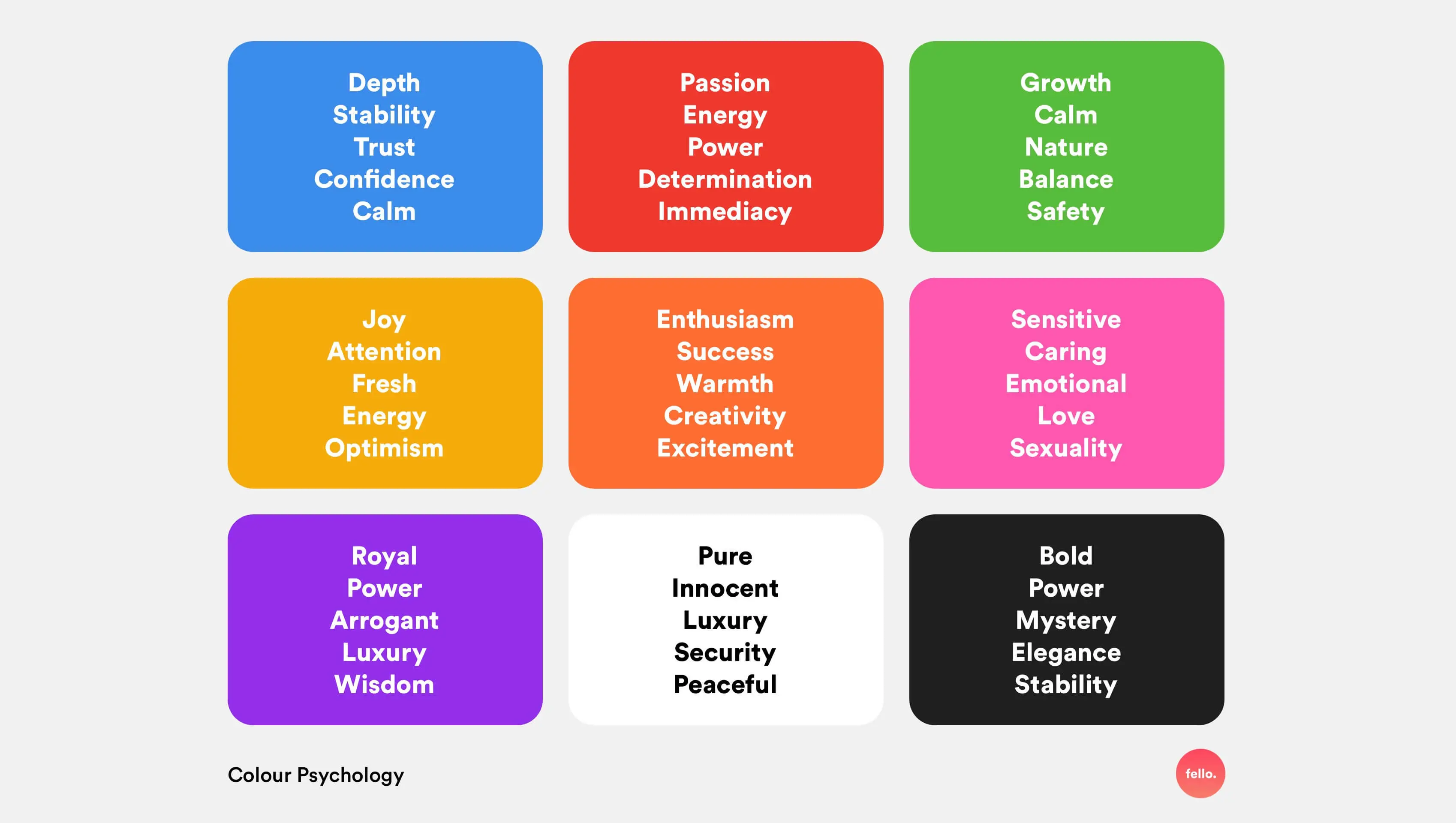
Colour psychology studies the effect colours have on people’s behaviour and how we perceive different things, whether our environment, food, or objects we use every day. Red gives a sense of urgency; green has been connected with health and nature. According to research, you can use blue for its calming effect since blue is your favourite colour.
When creating a professional infographic, try to stick with greens, blues, and greys. Don’t forget to keep the text white or black for the best readability.
Challenge With Typography
When thousands of fonts are available, choosing the right one for your infographic template can be challenging. And font selection is one of the least considered aspects of infographic design.
Choosing fonts for an infographic starts with considering the overall theme. Are you trying to convey a serious or playful tone? Remember to also think about your target audience and the infographic’s intent. If your goal is to share data, you will undoubtedly want to make the infographic look professional.
It helps to look at other infographics to consider how you should think about the thematic design.
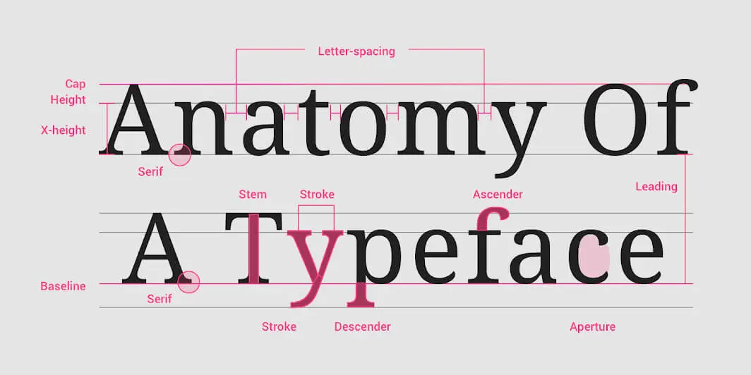
Choosing several ready-made fonts and using them however you like is not enough. To make a well-designed and eye-catching infographic, it’s vital to establish what weights, sizes, and fonts you will use in different sections.
Creating a font palette will keep your design compatible and improve your infographic look. You will also need to find fonts that work well together and utilise them in different parts of your infographic.
Step 2: Customise Your Custom Infographic With Icons
When conveying statistics or information, using image icons can greatly enhance the context and visual appeal in infographics.
Many graphic designers and marketers interested in creating great graphics will use infographic templates that often come with their own set of icons. Using suitable icons on your infographic template can significantly affect how your infographic is received. On the other hand, using the wrong icon will jeopardise your message.
Small icons that complement the text are crucial for a well-designed infographic. They should enhance your message without overpowering it, helping to frame the content elegantly.
Icons should be paired with the text in infographics; for instance, if your graphic is about a topic like high poverty rates, you will use monochrome icons instead of colourful cartoon icons. You also recommend using simple shapes to create borders and backgrounds around icons. It is also suggested that you:
- Find icons of the same style that will centre on the theme of the infographic template.
- Use a single icon colour to pull them together.
- Add simple icon shapes like borders and circles to give icons visual weight.
Step 3: Authentic Branding for Your Infographic
If you are using the infographic to promote your business or product, customise the chosen template to align with the company’s branding. You can use the company’s brand style guide and create infographics representing your brand’s voice and style.
You want to keep a connection between an image and a company in the audience’s mind. This ensures that the information you relay to the user is trustworthy.
What Do You Want People To Remember?
Not every infographic is an excellent piece of content. Take the information you would like to share and build a story around it:
- What do you want viewers to remember from the infographic?
- Why is this information essential for them to know?
- How will you make the message or data visually impactful?
Place Your Logo Correctly
Your company name and logo should not interrupt the body of your content. It is suggested that they be visible in the header or footer of the image.
Of course, you want everyone to remember your business name. Still, branding your infographic with your photo and logo will ensure that it is a trusted piece of design and content from a reputable organisation. Before doing this, be sure that your logo accurately represents your brand’s image.
Include A Call To Action
You need to include a call to action in your infographic. To figure out how your call to action should sound, answer these questions:
- Why are you creating an infographic?
- What do you want readers to do with it?
You may ask people to call you for a free consultation, check out your website, or suggest sharing the infographic on their social media.

Step 4: Use Storytelling And Check Data Sources
People usually overemphasise design in infographics. Different types of infographics require varying use of colours, font styles – and even thoughtful use of white space to follow the latest design trends. However, design is not the only thing you should focus on when creating a memorable infographic.
Data visualisation and infographics play a vital role in helping you succeed in the ever-changing business world. Both businesses and clients can recognise the need to create these two resources when using them correctly for educational purposes.
Data Storytelling
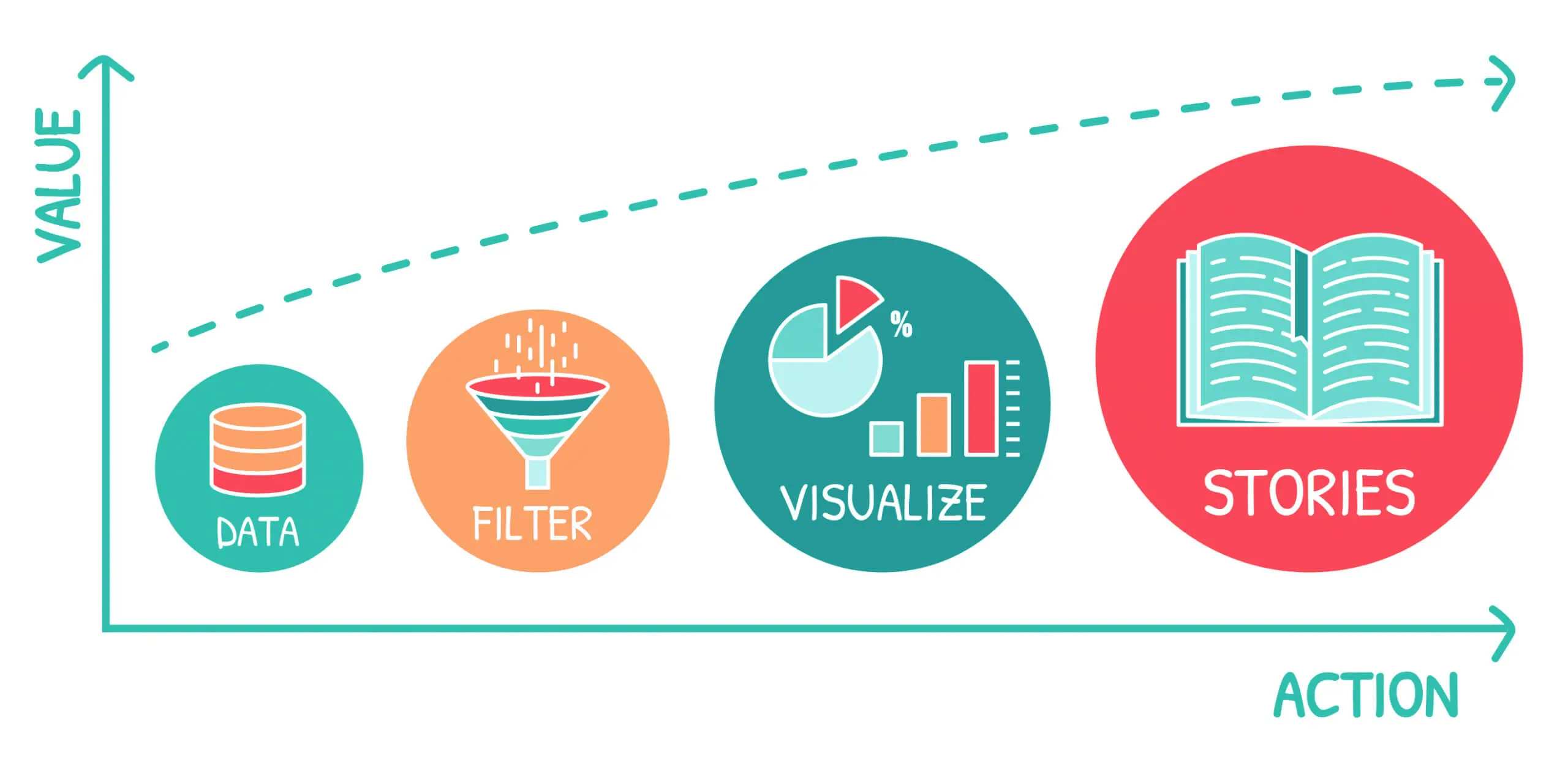
Data visualisation is a tool used to visualise data in a graphic form that the viewer can easily interpret. It needs to be aesthetically pleasing but not visually distracting to make the data stand out. There must be a balance between both the information and graphics presented.
An infographic, particularly an informational infographic, is a visual tool used to communicate complex information somehow. Above all, great infographics should be helpful and informative to an audience. And visual storytelling is an excellent way to help audience members interpret information.
Data storytelling is an excellent technique for guiding the audience through your information. Infographics are fantastic storytelling mediums, and good infographics tell stories that people won’t forget.
Check Data Sources
A good timeline infographic provides immense value by utilising trustworthy sources and placing them into an appropriate context for easy comprehension by the audience.
To do this right, you will have to learn more about sources of information and answer a few questions:
- Is this source trustworthy? Are these data sets verifiable?
- May I share this data? Are there any privacy concerns to be aware of?
- Is this information or data appropriate for the story and message I want to send?
Your own company is the first and most convenient place to find relevant and valuable data. Sales data, analytics, and insights from social networks can give you significant amounts of data to turn into an infographic. Just be sure you have permission to use it.
And if you ask a third party to create the infographic, you can credit them through an author box.
Step 5: Define Your Audience
You will not succeed when you attempt to create an infographic that appeals to everyone, and you will not succeed.
When creating infographics, one of the main questions is who it is made for. Perhaps it is for educating clients, or maybe for training employees. It is imperative to keep your audience in mind while creating graphics.
Ask yourself the following questions:
- Is your target audience external or internal?
- What is your target audience’s position?
- What is their level of knowledge?
You can skip over basic information when creating an infographic for internal audiences. You might need to explain primary data based on audience familiarity to people working on the same project for months. Skip over the basics and go more in-depth when your audience is experts.
Things are a bit different with an external audience — you must set the stage before explaining the details.
Consider what your audience will take away from reading and watching the infographic and how this information will be helpful. Make sure your infographic will be easy to read using words they understand and eliminate jargon.
Advantages of Using Infographics
Unlike data written on paper or displayed on a shared document, infographics are visually appealing.
Using infographics for your business campaign will increase your brand awareness and reach. Using the same colours, shapes, and messages will help your audience recognise and connect with your brand. This is an excellent way to reach many people and educate your audience about your company.
Infographics have the following benefits:
- They are attractive: Infographics are more eye-catching than text, combining images, colours, icons, and content.
- They draw attention: Most people have a short attention span, so they “scan” material rather than read the text. Infographics help the audience pay more attention to content for a longer time.
- They are shareable: You can use one on your blog or a website. You can easily share them via different social networks, creating a greater chance of becoming viral.
- Decrease space and increase promotion: When using infographics, you will save much space while significantly increasing the effect. One image is worth 1000 words; we have heard it many times and can assure you of high quality.
- Enhance SEO: A well-designed infographic will strengthen your SEO. Infographics drive targeted audiences to your website as they are more willing to “click” on it and “share” it.
- Increase engagement: Finally, infographics are fun and perfect for increasing engagement.
Best Tools For Creating Infographics
As an infographic creator, even on a free plan, you can use a variety of online platforms and useful tools to design compelling infographics. The process of creating your infographic might have required a tool like Photoshop or other Adobe Creative Cloud software. Although it might be time-consuming, with the explosion of easy-to-use, browser-based design tools, one can easily create infographics and free infographic maker tools, but that’s no longer the case.
Using free online infographic maker tools, creating infographics has become more straightforward. It doesn’t matter if your project is related to your job or for private purposes; Each new project starts with creating visual content. Search for templates, drag and drop elements, and then publish — it’s that simple. With the dimensions already set, and with a wide variety of stock photos readily accessible, you can quickly shift your focus towards creating effective designs according to the type of infographic you are working on.
Examples
Data visualisation is implemented broadly in newsletters, annual reports, eBooks, and white papers. Even without pro-level design skills, a newsletter is a great place to implement this when sharing valuable statistics. For an eBook document, data visualisation will show specific information and highlight important points from the text to your readers.
Annual reports are also an excellent opportunity to incorporate data visualisation techniques. To show your team and clients your current work progression, use infographics to create annual reports analysing the data collected. Additionally, you can place infographics in case studies, blog posts, and marketing content.
A Few Tips To Remember
When designing various types of infographics, including a comparison infographic, keep these important considerations in mind:
- Make it simple: The design should make for easy navigation around the information without confusing the viewer. Less is more about great infographics, so leave enough space for the eye and limit different colours.
- Try to be universal: Universal design is crucial so information can be accessible to anyone. An infographic will be easily understood using recognisable icons and images or even free templates.
- Be original: Each design should be original, whether your infographics are marketing content or a sales report. The design should be unique through the creative use of colour, fonts, text, and images.
Creating An Infographic
We hope we have helped you create a good infographic that is both great and memorable and can convey a story with each of the steps we mentioned and explained above. Infographics should be compelling in terms of the information and the design.
Studies have shown that people are 30 times more likely to look at infographics than plain data.
To get started, especially on a process infographic, the first step to creating your infographic from scratch is to decide on the topic. After this, research to gather plenty of information in your infographic. Make sure you have enough information that leaves no questions unanswered. Lastly, find visuals to help you with ideas for your information graphic.
Remember that the best infographics need to be easily consumable. It is an art to take all the data and concentrate it on one image. All graphics and images should also be optimised for an appealing visual appearance.
If your infographic makes sense after looking at it for less than 10 seconds, and it still teaches you things after carefully looking at it, you know it is good.
That’s all for this article, and we look forward to seeing you next time!

