Summary / TL;DR
Using colour strategically in marketing can significantly improve brand recognition, customer engagement, and sales conversions. While the psychological impact of colour in eCommerce isn’t fully defined, brands often benefit from colour associations—red for urgency, blue for trust, or green for action. Studies show correct use of colour can boost brand recognition by up to 80%, and influence 60–90% of purchase decisions. Colours help build brand identity, influence perceptions, and increase click-through rates, especially on call-to-action buttons. However, their emotional effect varies by gender, culture, and context, making audience research and consistency crucial in colour-driven design strategies.
What’s your favourite colour? It’s a simple question, yet colours in advertising have a big role in shaping our feelings and choices. They can even affect your heart rate. So, it’s no wonder they can influence customer behaviour too.
While the connection between colour psychology and eCommerce is not scientifically defined, using the right colours has helped companies create a distinct brand personality and boost conversion rates.
For instance, McDonald’s red and yellow colour depicts a welcoming yet powerful stance. Undoubtedly the most popular fast-food chain, the bright and optimistic colours have successfully attracted customers of all ages. On the other hand, Google “doesn’t follow the rules” with its multicoloured logo, especially the green letter L standing out in the primary colour scheme.
Let’s dig a little deeper into the colourful world of marketing campaigns and online advertising!
What Is Colour Psychology?
Colour psychology studies the mental and behavioural effects of colours when sighted and experienced by humans. From the taste of food to the attractiveness of an individual, colours influence our perceptions. However, our approach changes with age, gender and culture.
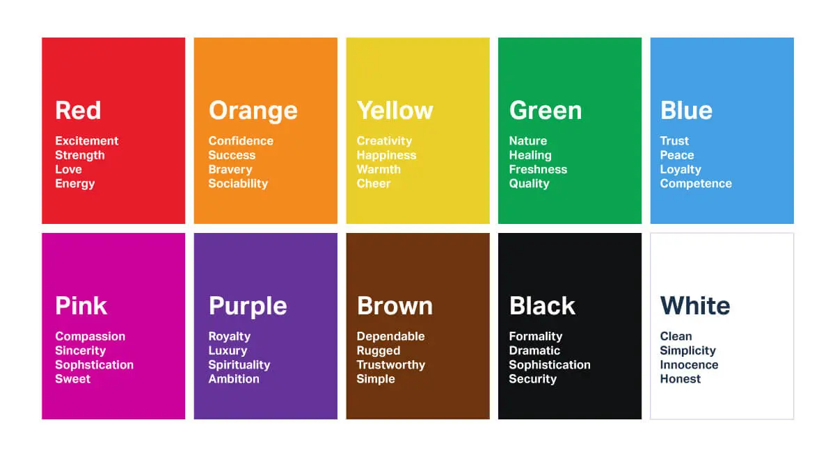
Like specific colours, some objects and people influence our state of mind; colours trigger certain emotions. According to colour therapy, warm colours like red and yellow evoke passion, optimism, anger, and insanity. Contrarily, cool colours like blue and green depict feelings of trust and balance or depression and boredom.
There’s no middle ground! This is why picking the right colour or combination becomes quite a challenge.
Want to receive updates? Sign up to our newsletter
Each time a new blog is posted, you’ll receive a notification, it’s really that simple.
How Can Colours Boost Sales?
Studies show that certain colours can significantly enhance your brand recognition and familiarity by 80%. After all, when potential buyers visit your website or store, they first consume the visual content. Thus, studying the effects of colours on your buyers’ preferences and behaviours becomes essential.
1. Builds A Brand Personality
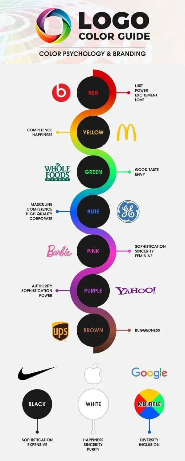
Like a brand’s social media account should represent its personality, its colour scheme should do the same. It should be chosen in a way that makes people feel a certain way — no wonder most fast-food chains use red in their logos, which triggers hunger. On the other hand, red is used in horror movies or series to invoke fear and dread.
So, when colours match the context, they craft a cohesive brand personality. Therefore, choosing colours aligned with your brand image or product is more crucial than the hue itself.
2. Makes Your Brand More Recognisable
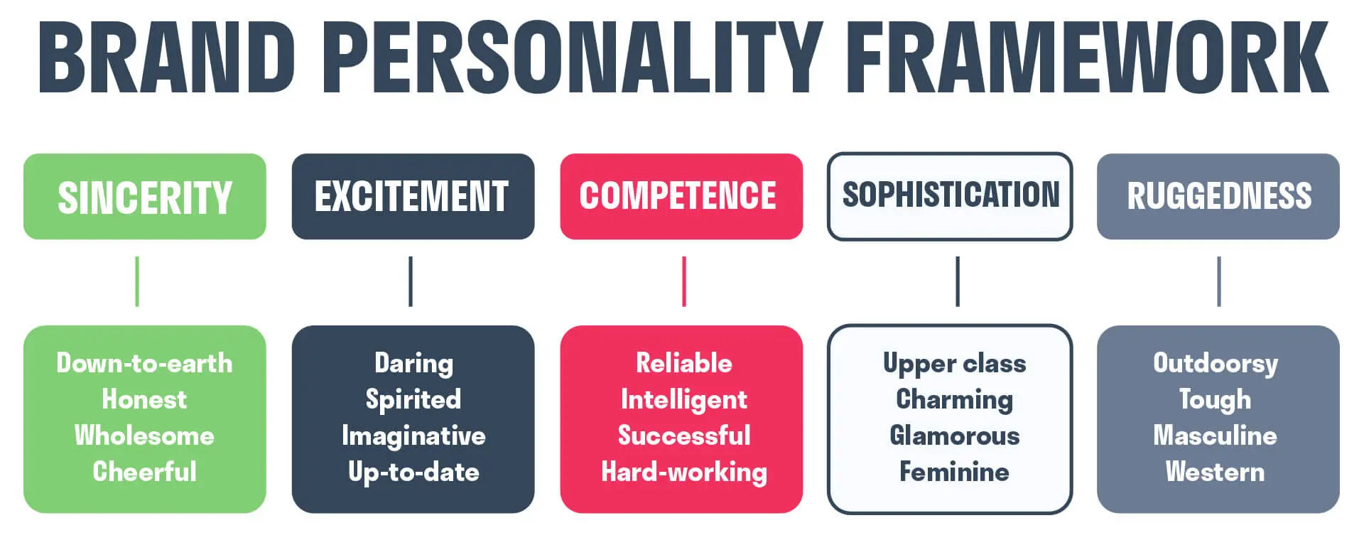
Many popular brands are instantly recognised by their colours. Think red for Coca-Cola, blue for Facebook, or the yellow and green of Subway. These colours come to mind and often influence our shopping choices.
Consumers tend to recognise colourful logos and advertisements more than those in black and white. Thus, if the colours are used correctly, they bring positive attention to your brand and product.
3. Attracts Customers
Most of us would hate to admit it, but we judge a book by its cover... or colour! It is what catches our attention on the first go. Studies show that 60-90% of customers unwittingly make decisions influenced by colour, and most buy a product solely because of its colour. Thus, your brand’s colours can either make or break your reputation.
4. Boosts Conversion Rates
When designing a small business website, you are bound to have areas where you want the customers to click or stay longer. Hence, it becomes crucial to understand behavioural psychology and choose appropriate colours to encourage specific actions. For example, CTA (call to action) buttons should have a bright colour to grab attention and make customers click on them.
Out of all the primary colours, red triggers action and a feeling of power and urgency. However, this dominant colour is like a double-edged sword and should be used sparingly like all other colours.
Orange is another colour that can encourage impulse clicks and purchases. Companies also use green as an appropriate colour for CTA buttons. Like the green traffic light, a green button means “go,” encouraging consumers to take action and increase their sales.
5. Makes Your Brand Unique
As mentioned earlier, the emotions and feelings associated with colours are subject to change. A single colour can have multiple meanings and evoke different emotions, from cultural differences to gender bias (no more extended binary).
For instance, red symbolises marriage and power in India, good luck and success in China, but mourning in South America. In Southeast Asia, Buddhist monks wear orange, associated with divinity and religion. On the other hand, Western people use orange to depict warmth and harvest.
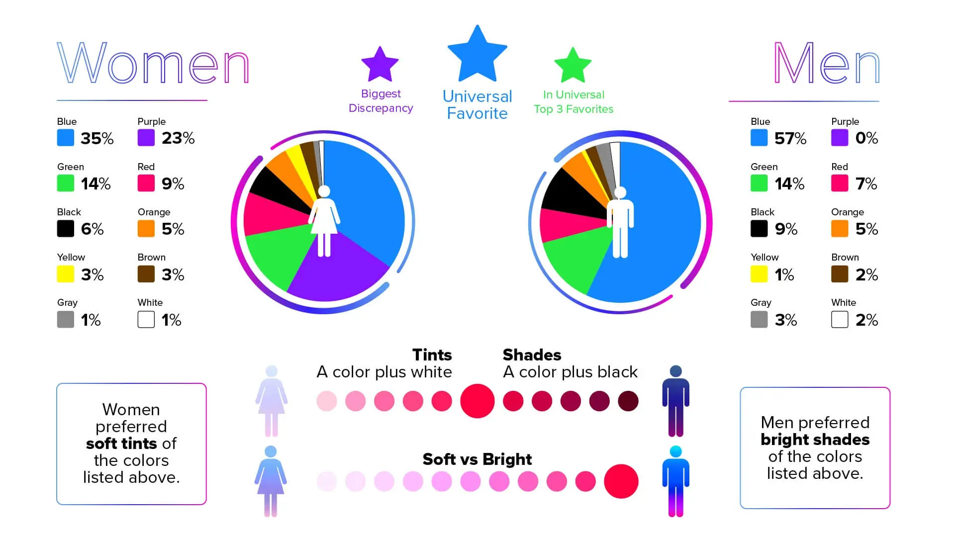
Most studies have shown that men and women have distinct colour preferences. While women prefer softer shades of red, blue, purple, and green, men are more attracted to darker shades and brighter tints. However, preferences of different genders and sexual orientations cannot be generalised, so you must be careful while choosing a colour that appeals to your target audience.
Using Google Analytics to identify your audience and recognise the preferences of that demographic can help a great deal in selecting a popular colour.
Top 10 Colours to Boost Sales
Many colours attract buyers, colours attract emotion, and even colours help convince and build trust. Take a look at the meaning of some of these colours below.
1. Red
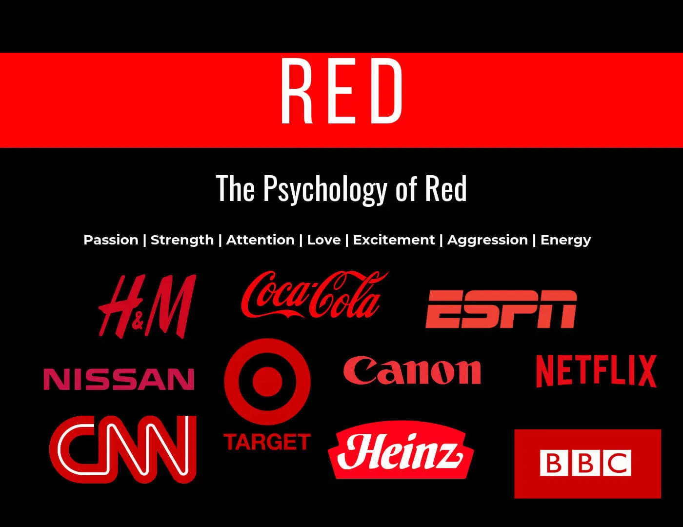
Red is a powerful colour that evokes power and danger. This colour can attract attention and retain it, thus making it the most popular colour among businesses. Think CTA buttons, SALE and banners. Most of them are red. That’s because it is known to perform well on most eCommerce websites.
2. Black
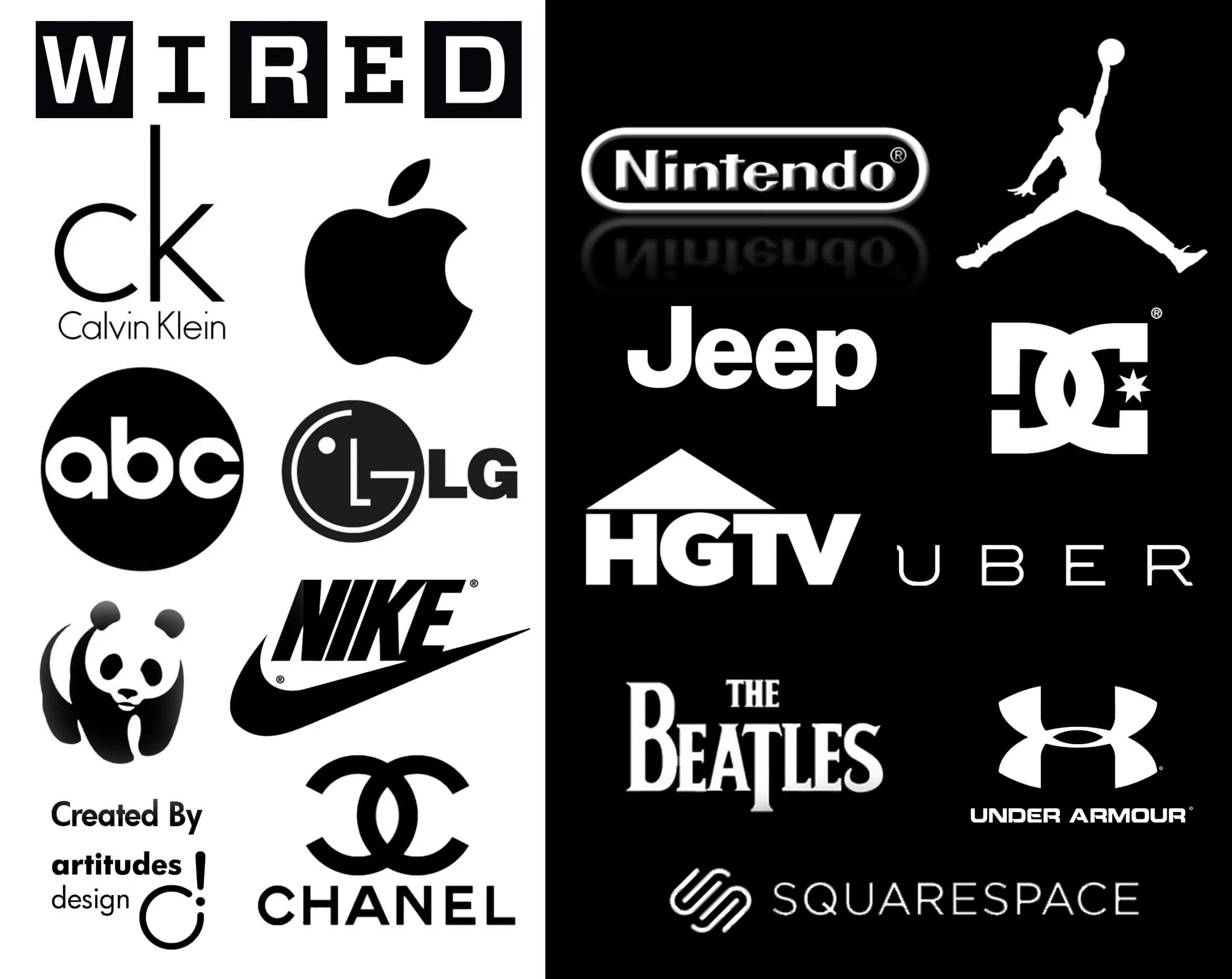
While most websites use bright colours combined with white, black can add a touch of elegance and class. Luxury brands such as Apple, Rolls-Royce, BMW, and Chanel use black to depict an air of class and exclusivity.
When used as a contrasting colour, black works great to add a dramatic vibe.
3. Yellow
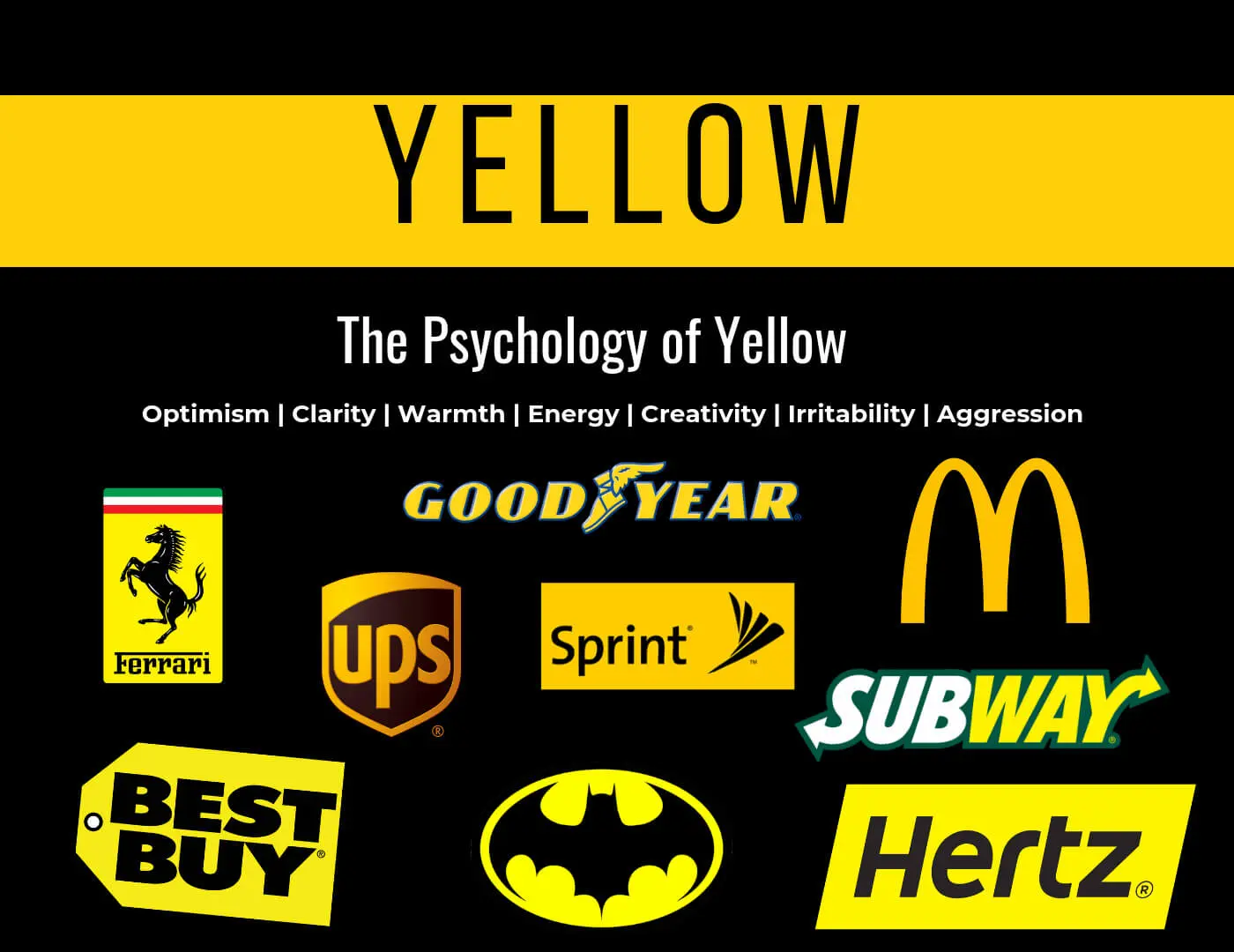
Yellow is the colour of youth and happiness (emojis in most SNS platforms), but it can also signify caution (traffic lights, warning signs). Most brands also use yellow as a welcoming colour and combine it with other colours to create a refreshing combination.
4. Blue
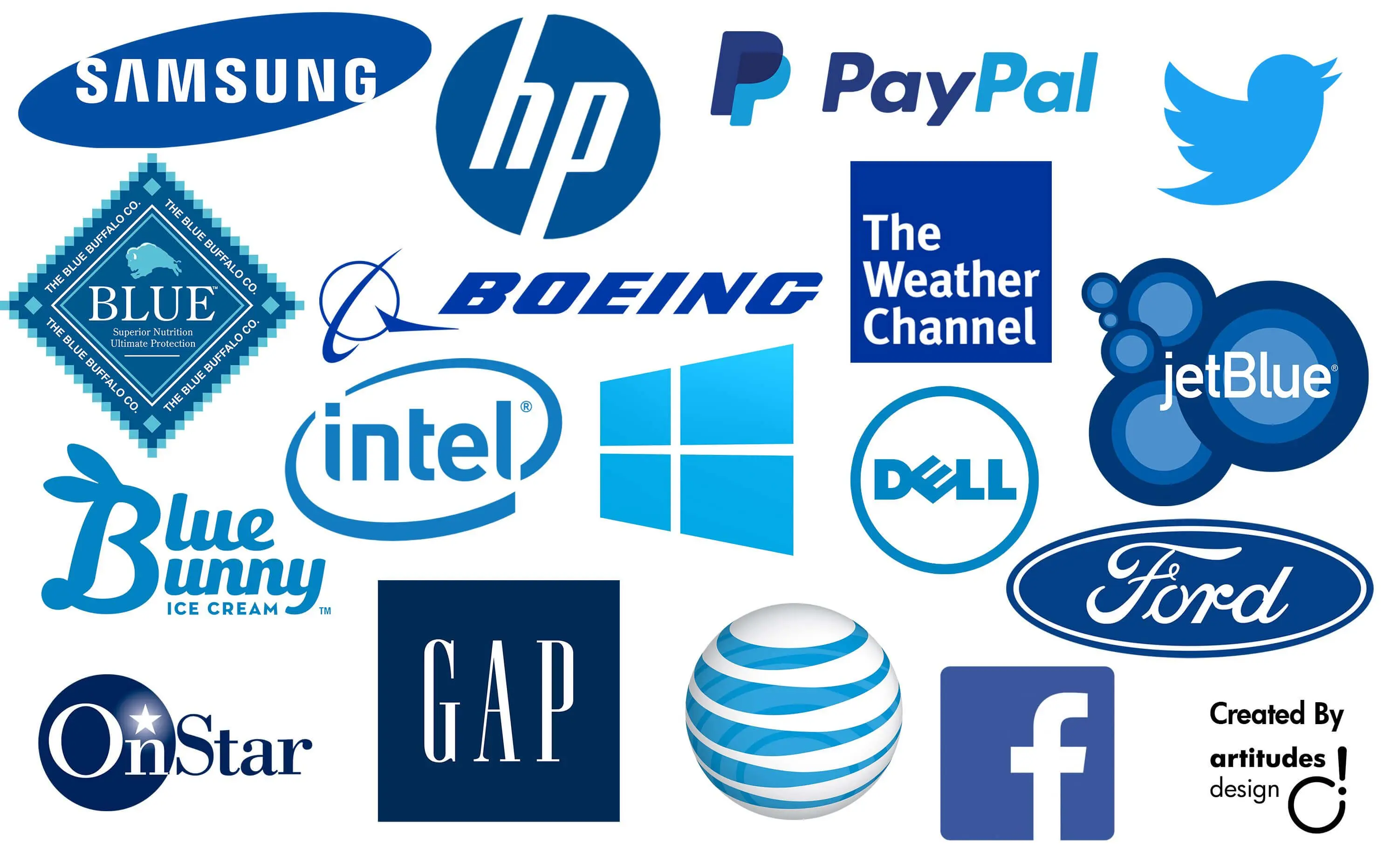
Blue is the colour for reliability and trust; thus, many financial institutions opt for it. Brands like PayPal, Visa, IBM, and Ikea use blue in their logos to convey professionalism and security in their logos.
Notice how fast-food chains do not go for this calm colour? That’s because blue is known to decrease appetite, which goes against their main motive, meaning lesser sales.
5. Pink
The colour pink denotes youth, excitement and, of course, romance. It is also considered a feminine colour, so most female websites opt for a pink layout. However, different shades can appeal to a male audience as well.
Companies selling baby products choose pink, often associated with freshness and new life.
6. Green
As mentioned earlier, green encourages action. Since it is the colour of the US Dollar, it means wealth and prosperity for many. It can also depict growth, making it ideal for marketing companies like Sagefrog.
Additionally, the word’ green’ encompasses all things nature. Companies selling eco-friendly products, in particular, utilise this colour to convey their brand ethos to portray their message. For instance, Starbucks’ recent shift towards energy-efficient practices is well denoted in its green logo.
7. Orange
Fun, energetic, and youthful- orange grabs attention without making you sweat with nervousness as red does! It is bold and fresh and ideal for startups and IT companies.
In terms of technicalities, orange acts as a complementary colours for many others. It works well as a foreground and a background colour. Yet orange is rare in branding, so consider using orange to stand out. However, since it is a warm colour, it reflects more light and can irritate vision, so use it moderately on your website.
8. Purple
The colour purple has been associated with royalty since time immemorial. Back then, ordinary people were not allowed to wear this colour!
Nowadays, purple is a unique colour that you can use for branding to attract a large female audience. Another connotation of this colour is spirituality, making it suitable for fitness brands and wellness products. For example, Curves is a women’s fitness brand with a purple logo to signify femininity and grace.
9. Brown
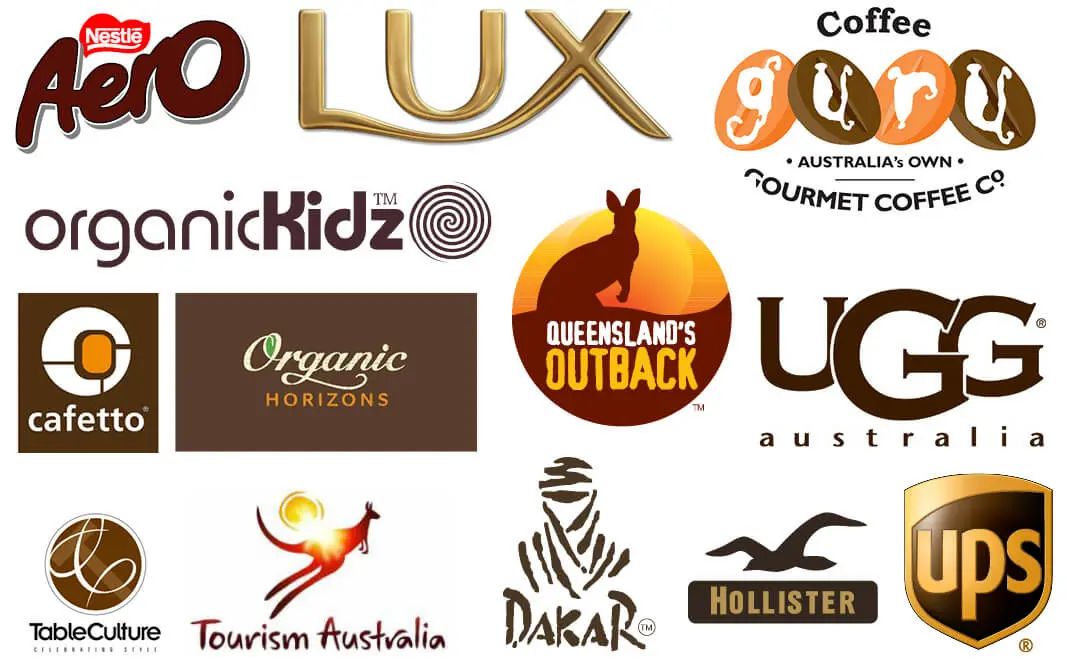
Despite being a no-no for Call-To-Action buttons, brown, when used correctly, can help your brand stand out. Only a few brands, such as UPS, are perfect examples of successful brown branding. Along with their slogan, “What can brown do for you?” this unique colour has helped the package delivery company have the edge over its competitors.
Additionally, brown, an earthy colour, works well with companies selling organic products, outdoor sports items, etc.
10. Gold
Gold is often used for luxury products to highlight exclusivity, symbolising wealth and prestige. An apt example of this idea is the golden crown on the Rolex logo.
How To Use Colours For Marketing?
1. Context Matters
There is no such thing as good or wrong colours. But, your brand’s colours- from the logo to the website header and ads- should be cohesive in the business world. And not to forget- these visual aspects should align with the aim of your business.
2. Make A Strategy
Choosing the perfect colour for your marketing materials and business is not enough. It would help if you decided how to use it strategically and meaningfully to make certain aspects of your site stand out and more memorable than the rest.
Thus, it is best to choose a muted white background with bold banners, buttons, and icons that catch the user’s attention.
3. Consistency Is Key
Whatever colour you choose, make it yours! Select one or two colours and stick to them. You don’t want to create confusion by changing your trademark colours repeatedly. Consistent with your colour palette will also help the customer remember your business.
4. Don’t Overdo It
Just because you found the perfect colour for your site does not mean you go overboard. Always leave some space with white or any light background. This will make your trademark colours pop and, thus, boost sales.
5. Experiment
Using the colour wheel and hit-and-trial approach is the best method to find out what works for your company website. Using Google Analytics and the colour wheel, you can opt for a colour combo that works for your business and your target audience.
Using Colours To Boost Your Sales
Even though colour psychology might not directly impact financial goals, a well-chosen colour scheme can greatly enhance your website’s performance. Since data backs its positive effects on branding and online marketing, testing different colours to boost sales is a no-brainer.
Worried about thinking you’ll have to start from scratch? Fret not! Test some colours on your logo, CTAs, and so on. But remember that the colours you choose should align with your brand image. While a neon green logo works well for Monster Energy, it may not be true for a banking company.
However, human behaviour is dynamic, and the same colours may affect each user differently. Thus, take your time to research and think about your brand image, product, and target customer.

