Summary / TL;DR
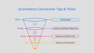
A call-to-action (CTA) in marketing prompts immediate audience responses and is essential for guiding users through sales funnels. Effective CTAs are concise, highlight urgency, and remove friction by offering clear instructions or incentives like free trials or discounts. Historically used in print ads, CTAs have evolved into digital tools such as clickable buttons, QR codes, and swipe features. Success depends on strategic placement—considering user reading patterns—and thoughtful design, including legible fonts, distinct colours, and ample white space. Overuse or vague wording can overwhelm users, while personalised, action-driven copy enhances conversion. Regular A/B testing and user behaviour tracking, like heat and scroll maps, help optimise CTAs for better engagement.
Here’s your initial exposure to compelling call-to-action examples right off the bat.
Your call-to-action, or CTA, should be a great way to grab the attention of potential customers and other visitors by mentioning a relevant pain point and getting straight to the point. For example, a call-to-action copy could read something like, “Need to create the perfect call-to-action right now?”
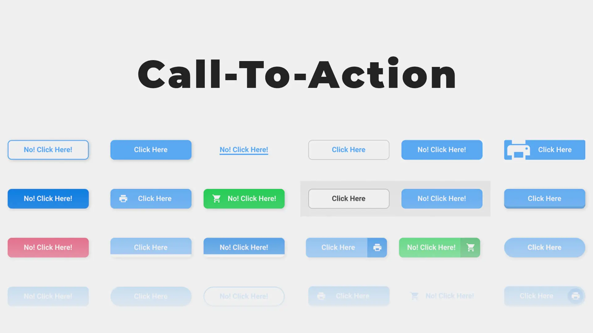
Clear instructions immediately follow, such as “Click here to find out how.” By being concise and conveying a sense of urgency with your copy, you set the tempo for the target audience and urge them to take immediate action.
Finally, by indicating the next step in a call-to-action button, you conveniently provide an instant option that may turn visits into leads successfully. Perhaps, what “stop beating around the bush” means in layman’s terms translates to a clear “call-to-action” in marketing jargon.
In the same spirit, you should take action today and get started with our guide on employing a compelling CTA in your marketing campaign.
Want to receive updates? Sign up to our newsletter
Each time a new blog is posted, you’ll receive a notification, it’s really that simple.
The Importance Of Clear Call-To-Actions On Your Marketing Material
What Is A Call-to-Action (CTA)?
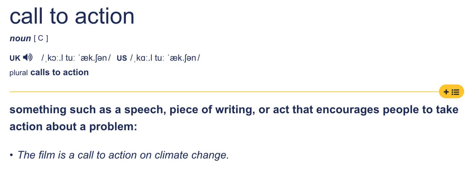
A call to action, or CTA, is a marketing term for any design meant to spark an immediate response. These phrases or words are often woven into sales scripts, ads, or web pages to urge audiences to take action.
A call-to-action marketing tactic invites or appeals to users to take immediate action. It works like persuasive writing and is not limited to digital or email marketing campaigns.
Although most common on online marketing platforms, including Facebook Ads, in this tech-driven age, calls to action are their main goal, integrated into political campaigns and print marketing. Some strategies used in online marketing have been adapted from these traditional formats.
Traditional Calls To Action
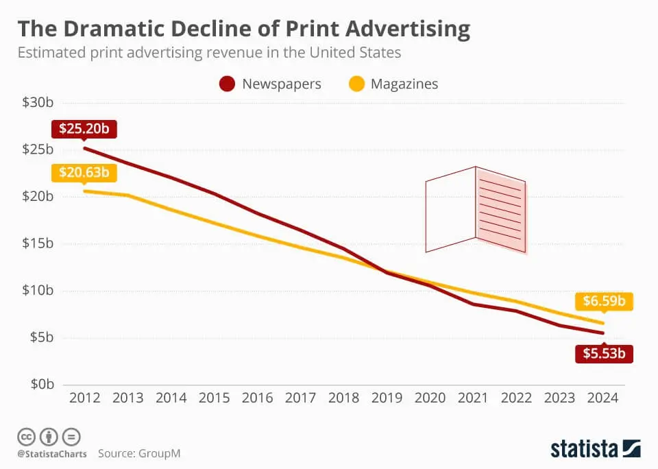
Before marketing became primarily digital, direct mail promotions were popular for engaging with an audience and receiving responses. As demonstrated by many print businesses, these CTAs would often take the form of ads and separate inserts attached to the middle pages or slip out of the magazine.
The CTA copy may encourage readers to mail their request to start a new subscription or enter a contest. Usually, they will include one-liners in big, bold letters that indicate clear instructions and, perhaps, an enticing offer.
As an exercise, take a look at these sample CTA copies from print magazines and ponder over the tactics they employ:
- “You can mail in the subscription form TODAY and pay LATER!”
- “If you send us your response in the enclosed card today, we will take care of the postage.”
The first example is probably related to a new subscription or the renewal of an existing one. Within this single line, the brand indicates a sense of urgency while also emphasising that interested readers need only send in the form and not worry about the payment.
After all, what good is an enticing CTA tactic if users don’t know what to mail or how to go about it? At the same time, the overall tone of the copy indicates that the user has a choice, which inadvertently builds consumer trust.
In the second sample, the brand offers to pay mailing charges while providing potential customers with a choice. The magazine also includes an envelope through which readers could send their replies to make the process increasingly convenient. Similarly, some companies may implement marketing strategies such as offering a free trial or discounted prices for a limited time.
Interestingly, some brands continue to mail marketing materials and products directly to homes, perhaps with some success. On the other hand, imagine the leads and conversion rates if a brand still expected users to mail in forms and other material via post.
The digital space has changed how users and brands interact, thus calling for traditional but practical CTAS to adapt to the new digital age.
Digitalising Traditional Calls To Action
In an instant gratification world where competitors continually invest in online marketing strategies, adhering to best practices means understanding that expecting mail responses won’t lead to leads. That said, conversions are more likely if you supplement a direct mail CTA tactic with digital aspects. Here are a few ways to go about it:
1. Website Links
Ensure that you have a landing page ready — visitors should be able to learn more about the company and its products from this site. With the initial mailer and concise CTA, you may only be able to fit in many words. It is best to set up an official company website or, perhaps, a product page and mention the URL before sending it to customers.
Alternatively, you may print a QR code for added ease of access and a much more structured mailer since URLS are often a confusing jumble of characters. Or tap into technology by printing NFC tags onto the mailer so that users can go to the web page to perform the desired action with a slight tap of their phones.
2. Email Or Phone Number
You could redirect potential visitors to give their email address to the website’s “Contact Us” page, complete with a contact form or mention an email ID or phone number with the CTA. However, remember that a cTA stands as it contains action verbs and a clear message.
You may use phrases such as “Call us now to get free shipping” and “Visit our website for a free consultancy”. On the other hand, passive or ambiguous statements, such as ‘Take a look at our prices’ or ‘Get started today by looking at our product or service offering’, defeat the true purpose of a CTA.
Additionally, you can add an office address and supplement it with VDP-enabled maps.

3. Reinventing Traditional CTAs
These days, you might consider going fully digital with your business. As longstanding industries, like printing, move to online platforms, following their lead could help you avoid financial setbacks.
You can learn from early digital campaigns — not only to replace the return envelopes with clickable primary buttons that lead to landing pages, but also to consider the strategic use of a secondary CTA as part of the strategy for small business owners. However, your CTA tactic may be outdated if the layout is too reminiscent of print magazine mailers.
Think about it — currently, clickable buttons are being replaced by swipe-up features in the fast-developing digital space.
This is not to say you should abandon original calls to action completely, especially given the current age of digital marketing. Some successful businesses, such as W magazine, continue using the same language and marketing tactics they did during the peak of print magazines, but in a digital format.
Even after the shift, the company offered a free first copy to subscribers, who could cancel their membership. This offer is virtually risk-free for the customers, and they have nothing to lose but everything to gain, which is also possibly what the CTA copy described.
This idea and approach translate well across platforms, but they are made even better due to the immediacy of the fast-paced digital world. After all, consider how responding to the mailer would require potential customers to mail in their response, make a purchase, and wait a few weeks before receiving their free copy.
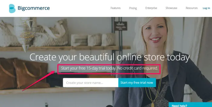
In comparison, instant access to the magazine with a button is considerably more tempting. And that is just the tip of the iceberg.
Digital CTAs provide immediacy in a myriad of forms. These include free trial buttons, subscription deals, limited offer pop-ups, social media share buttons, etc.
9 Ways To Create An Effective Call-To-Action Button
Sometimes, a simple tweak in your copy may be what you need to engage your audience and lead their views to your sales funnel. Or perhaps you need to inject verbs into your CTA buttons or use a bright colour to make it stand out. Indeed, the key to an engaging call to action lies in its simplicity.
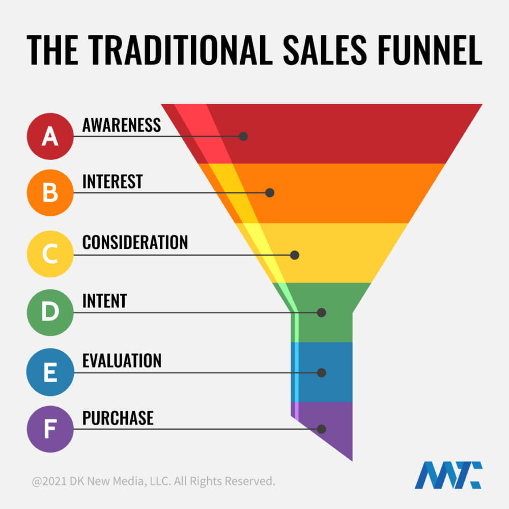
This is not to say that creating effective CTA buttons is easy. Incorrect placement, too many calls to action, and a confusing copy can lead to a weak call to action, not unlike an ineffective salesperson. So, to avoid such common errors, follow our handy tips:
1. Create A Sense Of Urgency
A common mistake in weak CTA buttons is a lack of timing words. Don’t underestimate the power of simple words like “now” and “today”. Of course, you should supplement these strong action words with directions for your audience to take. Here are a few ways to go about it:
- Get started now
- Try it for free today
- Download now
A company may use several tools to create a sense of scarcity or urgency, which rushes your viewers to take action. They may do this by adding a widget that shows the number of products bought in the last few hours, combined with a countdown indicating that the offer will end soon.
You can inject timing words around the landing page to enhance the effect. For instance, if your brand specialises in creating landing pages or blogs, let customers know they can sign up in seconds or build a page with your designing tools within five minutes.
In a world where time is money, customers will appreciate companies that value their time. Simultaneously, announcing that products are running out leverages the human psychological need to grasp what they can’t have quickly, thus urging people to click without a second thought.
At the same time, keep in mind that exploiting or faking scarcity could become counteractive as it ruins buyers’ trust; this can look like it’s consequently hurting future sales.
2. Free Trial And Other Offers
Win sales and boost your conversions with the help of extra perks. Aptly known as “click triggers”, a few CTA examples of these are:
- Buy now and get 20 per cent off
- Money-back guarantee on all sales today
- No credit card required
- Free worldwide shipping
If your company can afford a slightly longer CTA copy, consider injecting a no-obligation statement. W magazine, for example, offers a free trial copy before the customer can make a long-term commitment.
Similarly, an online business could allow the viewer to access a website or its service for a Limited time before subscribing as a premium member. Check our related articles to learn more. You could write the CTA button for this in a few different ways, such as:
- Try it free for 30 days
- Start my free trial now
On the other hand, high-pressure CTAs are more likely to lose sales as their marketing strategy may be too aggressive. For instance, a site may open with a pop-up that hides all the content. Visitors may be required to sign up for the company newsletter or pay a premium to access the website or the brand’s service.
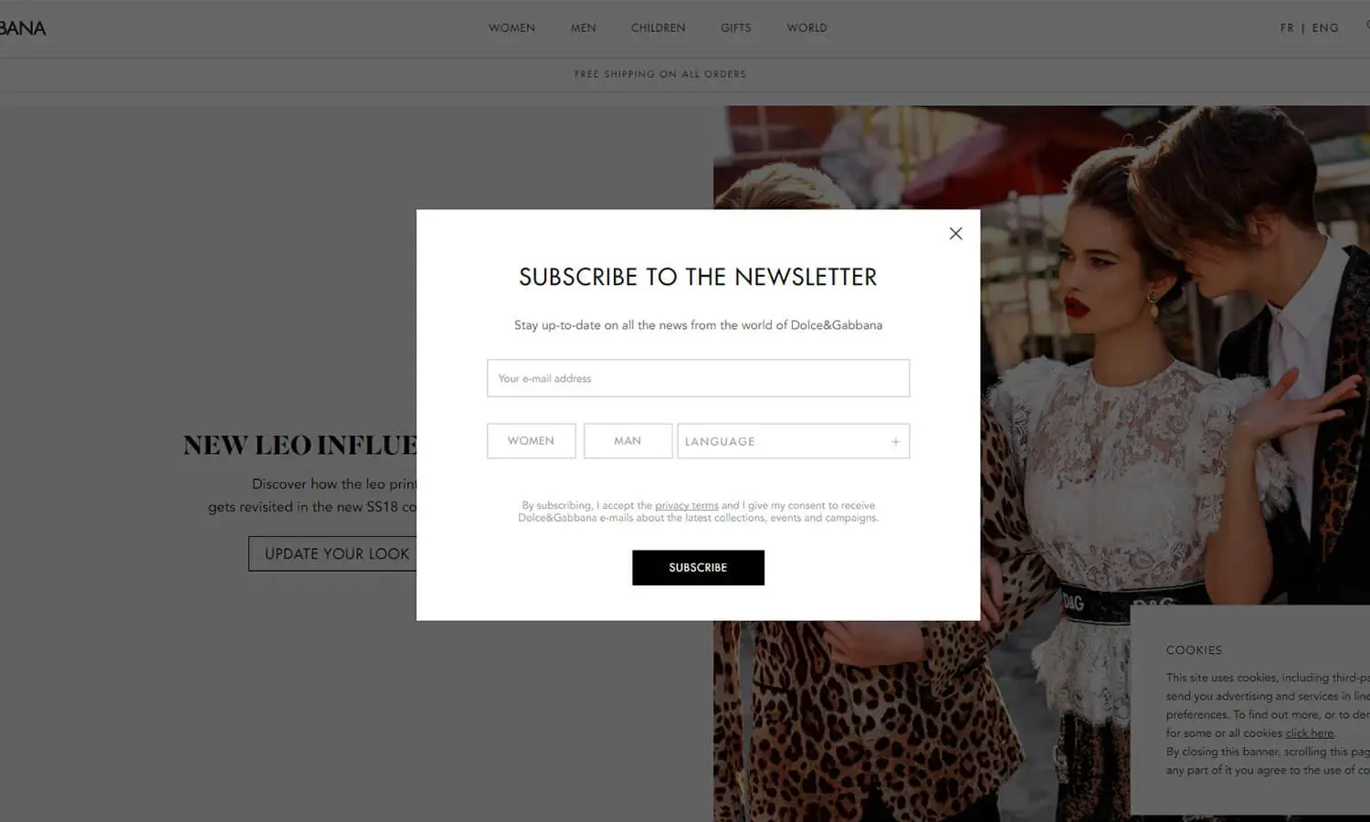
Either way, it’s more likely that the viewer will take their business elsewhere due to the lack of freedom or choices. It’s safe to say that an effective tactic to encourage your audience to bring customers to your sales funnel is to allow them to “try it before they buy it.”
3. Correct Placement
Asking users to subscribe to enter the company website may be a high-pressure tactic. And yet, a company still needs those clicks and subscriptions to boost conversions. In such a case, the clever placement of the CTA button may minimise the aggressiveness of the approach.
For instance, you can add the subscription CTA button just before the user purchases an item instead of welcoming the visitors with a pop-up. After all, if the customer has placed items in their shopping cart and is about to finish the payment, it is improbable that they will abandon the website because of a pop-up.
Users must provide their email and other details to receive the payment confirmation and tracking information.
A) In A Landing Page
Besides placing CTA buttons on the correct page, consider that positioning a clickable button within the page also matters. After all, what good is an illustrative or clever call-to-action button if it escapes the attention of visitors?
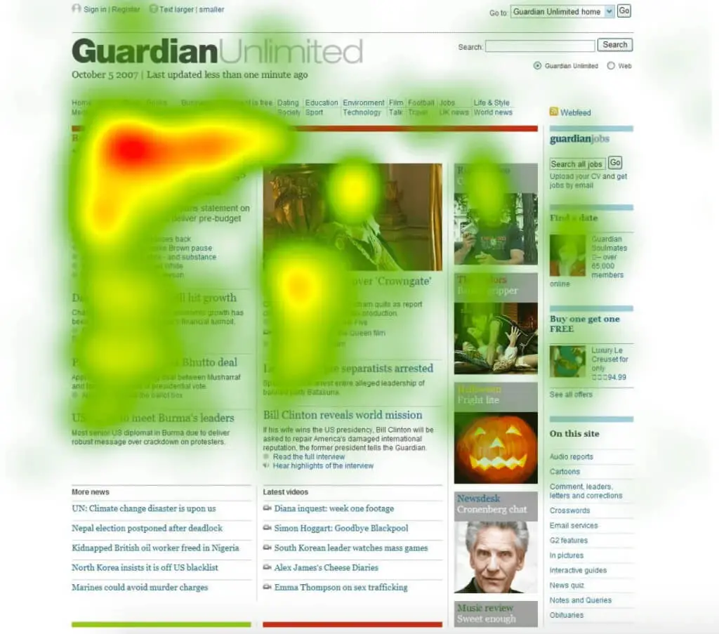
For this, consider the reading behaviour of your audience — where they begin to read, where they pause and where they end. According to studies, most people are likely to read in an F-shaped pattern. In other words, your visitors will peruse the first few lines above the fold horizontally, forming the top bar of the “F” shape.
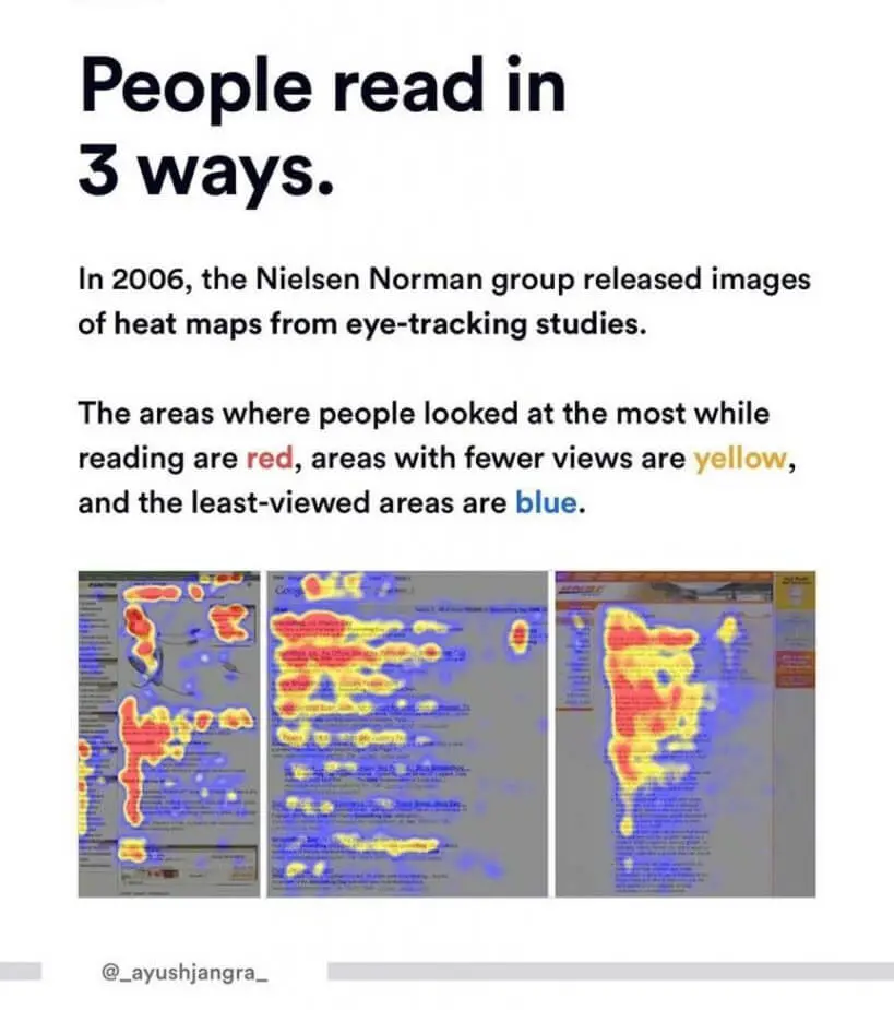
The next step is often to read another shorter horizontal line before scanning the rest of the article vertically. With this pattern in mind, you can decide to create a positioning plan for your CTA buttons. The only way to identify the best strategy is to experiment and conduct split tests.
But marketing strategists often suggest you place the button right on top, above the fold. This move, dictated by social proof, does not guarantee leads, especially if your landing page is an informative blog post. It is not a particularly good tactic if sales depend on providing customers with necessary details and instructions that are too complex to fit into a short copy.
In such instances, you may be better off placing the call-to-action button at the end and below the fold so that users feel they are making an informed decision when they click it. For instance, if your company deals in mobile phones, users will want to inspect every feature and detail of a model before taking the next step.
On the other hand, if you own a photo editing website, a simple free trial or sign-up CTA button anywhere above the fold and even under the main header may lead to conversions.
In summary, understanding your audience’s needs and tweaking elements on the landing page could help convert views. Or get your CTA buttons noticed, at the very least.
B) In A Video
A website home page can get away with a straightforward CTA button placed above or below the fold, but what about a video?
Although some streamers and YouTubers may ask you to like and subscribe before presenting their content, the directive does not have a powerful effect, as it does not provide any incentive. While magazines or websites offer free trials, the same cannot apply to videos. Unless you are talking about movies, the audience can probably watch the trailer before streaming the movie.
Moreover, appealing to the audience to hit the social media share buttons or visit your website too early means they may forget to follow the request after viewing the video. On the other hand, waiting too long to add a call-to-action button may cost you sales if the audience moves on to the next video halfway through.
A fantastic video and meaningful content that grasps the viewer’s attention till the end are vital in this situation.
Here, and perhaps while creating a blog post, you may use the concept of “delayed gratification” to your optimal advantage. In other words, keep the audience guessing about your next move and delay the CTA button so the viewer grasps the opportunity once it appears.
4. Captivating Font
Does red, green, white, or black matter what font colour you use?
Yes, indeed — colour psychology can make or break a marketing campaign as it immediately affects first impressions and sets the tone of your brand. And this is not just limited to online marketing tools or the font colour of your call-to-action button.
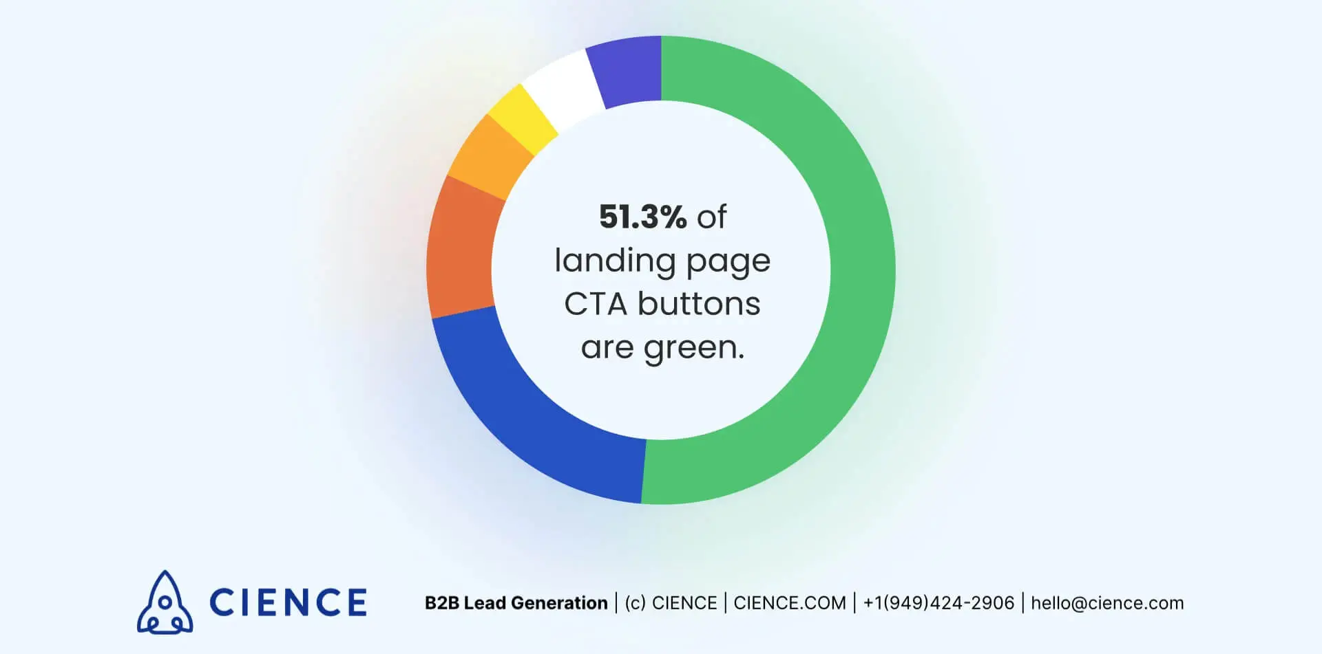
It’s an excellent exercise to learn more about adding value to your blog post header, blog content, product designs, videos, logos, campaigns and other business tools. For instance, if your business is related to environment-friendly solutions, you can opt for a green theme to match its green approach. Similarly, blue is an excellent trust-building colour, whereas orange indicates positivity.
A) Colour
The font colour in your call-to-action button should be a neutral shade, and the background should be a solid gradient. Also, make sure to pick a solid colour that isn’t too flashy but also not too dull so that it doesn’t escape someone’s attention as they skim through the content.
One of the safest options for a call-to-action button background colour is orange. Dubbed by many marketing experts as B.O.B. or the Big Orange Button, these are peppy and positive without being excessively loud.
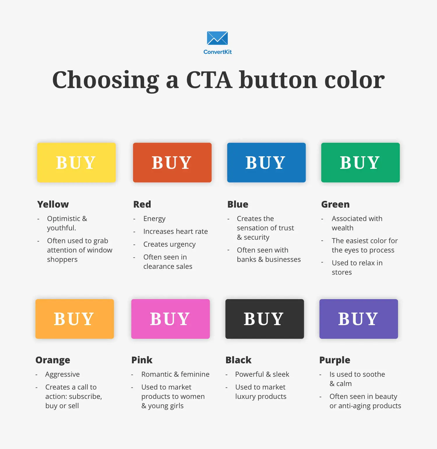
We recommend that you A/B test a solution before making the ultimate decision, as the “right” colour for a business depends on various factors. For instance, if you own a female-centred business, the target audience may be more attracted to lavender tones. Similarly, women are more drawn to soft tints, whereas men prefer brighter shades.
Blue is the most popular colour for many people, while brown tends to be less favoured.
B) Text
Although an elaborate and beautiful font may seem like a great design idea, leaving the clever bits to other parts is always best. After all, if a CTA is a straightforward and urgent appeal, even the font should be practical and reflect the same.
It would be best if you made sure that the CTA is legible. Stick with a clean and minimalistic serif or sans serif font. If you employ a script font, perhaps you can place it in big, bold letters at the top to make it easier to read.
5. White Spaces
Incorporate margins or a thick white border around your CTA to give it a clean look. This handy feature is also known as negative space. White space separates the CTA from the rest and creates a seamless design without crowding up your website layout.
Interestingly, some believe white spaces are accidents or defaults that must be fixed. However, this is far from the truth. Most experts and experienced web designers invest plenty of time building components within a white space. All the attention falls on the primary focus, thus providing a clear purpose.
You can couple this with spaced-out elements within the CTA, such as the copy, CTA button, graphics, and other visual tools, which we will delve into in the next segment.
6. Visual Tweaks
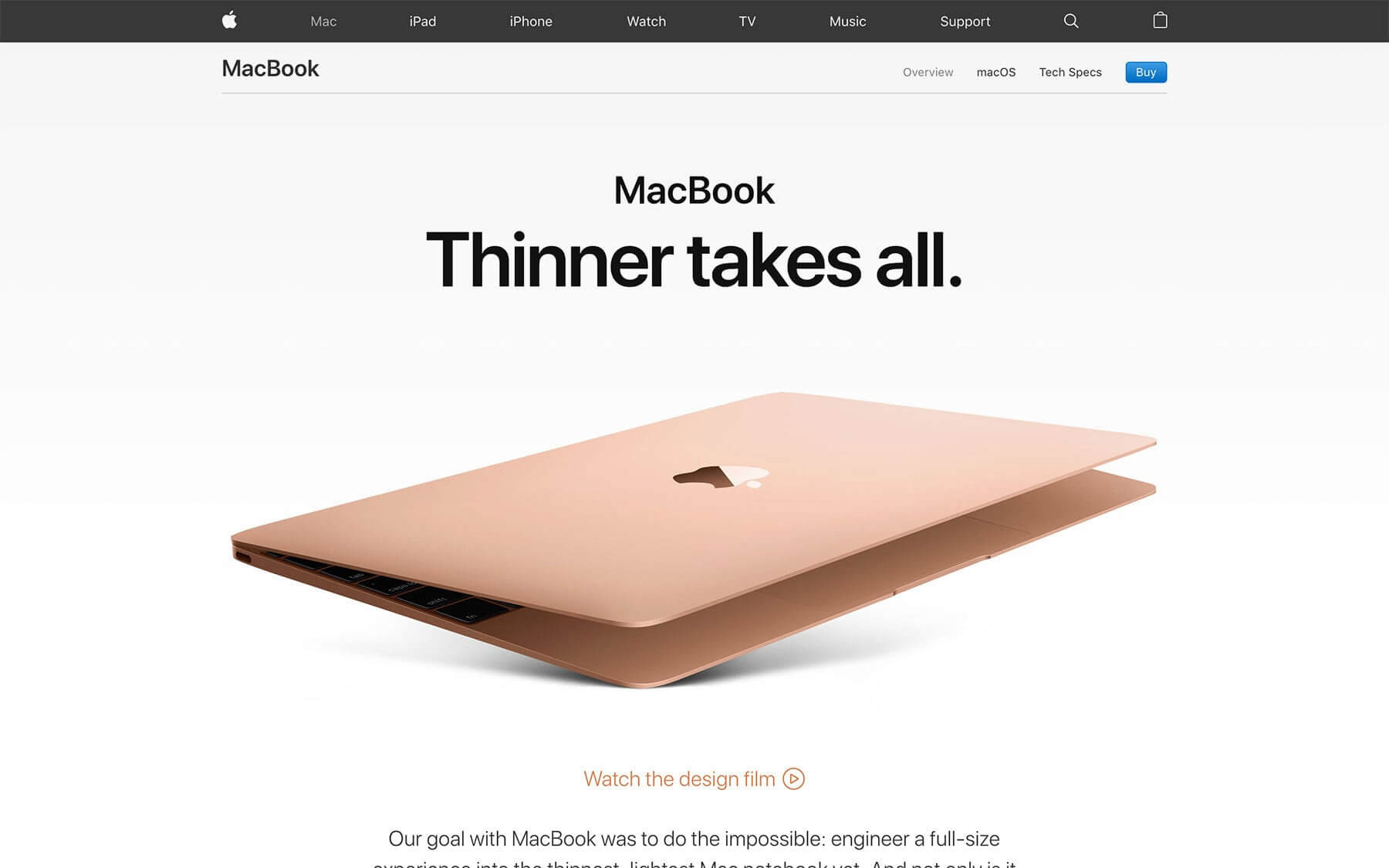
You don’t need the best designer in town to create an attractive CTA. Small changes, such as switching from a boxy CTA to one with rounded edges, may give the button a new look. Other simple features, such as large fonts and white space, can amp up the clean look of the CTA.
Adding graphics and other special effects can create a more elaborate design. For instance, you can place a single or a set of simple clip art images relevant to your business. Or perhaps a unique logo indicates the service you provide.
Some successful CTAs also incorporate mock-ups of their past work so the customer knows what to expect. Consequently, this incentivises potential customers to click the CTA button. While this strategy is well-suited for some more than others — web designers, in particular, have an edge in this department –there are plenty of other ways to jazz things up.
One of the easiest ways to do this is to look for stock photos to accompany the copy—these provide instant elegance with minimal effort. Similarly, a simple shape, such as an arrow pointing towards the CTA button, lends a whimsical touch while also being a practical tool.
If you want to take things up a notch, why not add special effects and animations to the CTA button? A CTA button that comes to life when the mouse hovers over it will likely attract attention and clicks while adding a fun design element to the website.
7. Problem Of Plenty
Some call it the “problem of plenty,” while others call it “analysis paralysis.” The point is that you should not bombard users with too many CTAs.
Often, a brand might resort to placing multiple CTAs. After all, the more choices users have, the more likely they are to click, right? Unfortunately, studies have proven that this may not always be the case. Customers have more difficulty deciding when faced with a slew of options.
Take time to prioritise what you want users to do, and use that in your primary call-to-action button. However, you can supplement it with a second button, albeit in a smaller font, so it does not compete for attention.
At the same time, this tactic works with the “no-obligation” rule in mind; by offering two options, the CTA won’t feel like a request. For instance, the landing page may consist of two CTA buttons. Here, the primary button may read “Download now”, whereas the muted option may say, “See other similar products.”
As a rule of thumb, narrow your CTAs to two per page.
In keeping things short, ensure that the copy on your CTA button is concise yet compelling. As a rule of thumb, it should not exceed 60 characters.
As an additional tip, we recommend that you read the copy to yourself out loud a few times before finalising it. If you notice that a word has more than five syllables, it is probably best to replace it with another word or phrase with no more than two or three syllables.
However, there are no hard-and-fast rules while creating a call-to-action copy — apart from the fact that it must be relevant to the audience and get the message across.
8. The Power Of Power Words
There is a lot of talk about providing a compelling call-to-action copy, but what does it entail?
Considering how a concise and straightforward call-to-action button has a limited set of words — or should have a limited set of words, you must use the right ones. To turn a ho-hum sentence into an enticing traffic magnet, you should inject what is known as “power words” into marketing jargon.
Fortunately, these words are tried and tested and have successfully turned many average CTAs into compelling ones. Here are a few examples:
A) Free
Who doesn’t like free stuff with no strings attached? We have already discussed how customers appreciate call-to-action phrases that indicate the brand values their time. Offering perks at no cost demonstrates a willingness to save them time and money.
- Get free goodies with every purchase
- Download your free recipe book here
B) Discover
Along with related words, such as “reveal” and “secret”, the term “discover” lends an aura of mystery and anticipation. Consider other alternatives that may probably indicate the same meaning, including “learn how to”, “find out”, etc.
They are more effective in intriguing users and piquing interest when compared with these practical yet relatively mundane phrases. Here are a few ways you can use these to your advantage:
- Discover the world by subscribing to our newsletter
- Click to discover my top five secrets for weight loss
C) You/My
There is an ongoing debate about which one is more effective — first-person or second-person pronouns. Of course, the most foolproof way of knowing is to test it out with the help of A/B tests.
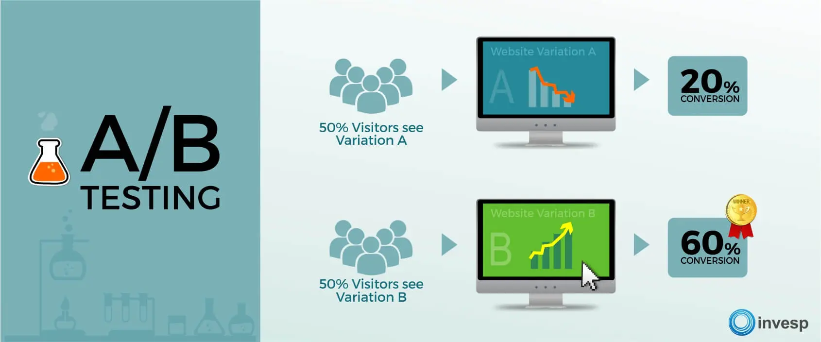
You can create a call-to-action on “Get my free e-book now” or “Get your free e-book now” and see which works best. Anyhow, the power of these words lies in the fact that they help connect customers with the brand by using personalised language.
A few other words you can inject into your CTA and work around with are:
- Introducing
- Amazing
- Instantly
- Create
- Promote
- Increase
- Inspire
9. Check Your Progress
Considering each point in this guide and applying it according to your website stats, draw a road map and execute the plan. However, don’t forget to track how users respond to the new changes. To help you with this process, you could take the help of online data visualisation techniques, such as these:
A) Recording
You can use the service of a third-party website that provides a recording of how users interact with your landing page in real time. It would be best if you often pasted the website URL, and the screen would immediately move about, getting stuck in places where users may have encountered issues.
This is an excellent way of diagnosing problem areas and tracking how long users stay on a website. Generally, you may find that adding CTA buttons where the user pauses frequently boosts click rates and conversions.
On the other hand, if users seem to get stuck in a particular place too often, it may be a sign of navigation issues that must be fixed promptly. Sometimes, these problems arise because the website is not optimised for mobile devices.
B) Heat Map
Often, a heat map will glow red to point out the areas in your website that attract the most attention. Ideally, you would want your call-to-action to receive the most clicks. If not, perhaps it is time to retrace your steps and figure out whether the problem lies in the campaign strategy or that users cannot recognise clickable options.
C) Scroll Map
As the name suggests, this tool will help you determine exactly how far the user scrolls before closing the website. If you find that users are leaving before reaching the point where you have placed the call-to-action button, consider moving it higher.
Examples Of Calls to Action
Need some more inspiration in the form of some call-to-action examples? Here are a few successful social media outlets and apps that have employed a few of the CTA tactics mentioned before. Test how many of them you can recognise.
1. Spotify
Notorious for interrupting playlists with ads, Spotify uses several strategies to beckon users to sign up for a premium account. Indeed, a customised CTA is also one of them.
When you open the Spotify home dashboard, you will see two options — “Go Premium” and “Play Free”. Notice how both of these CTA buttons stand out and utilise action verbs. Secondly, you may have observed how the “To go Premium” option is highlighted with bright lime green, whereas the “Play Free” button blends in with the rest of the website.
Can you guess why the brand has selected these two different colour schemes?

2. OkCupid
Considering how OkCupid is a dating app designed to attract those who value long-term relationships, the minimalistic approach demonstrated in its CTA is nothing short of brilliant. The user focuses on the brief and straightforward sign-up details by opting for a plain blue background. These questions are seemingly relevant to what users are looking for in a partner with shared interests.
Let’s not forget the page’s adorable graphics and clever one-liners. Although these talk about algorithms and request users to sign up or download the app, the language and visual tools create a laid-back aura that does not stray from the idea of romance.
3. Pinterest
Once you open the Pinterest home page, you will be presented with a few sign-in options. However, highlighted in its signature blue hue, the “Continue with Facebook” option stands out — perhaps indicating that the brand prefers users to log in through this path.
In comparison, the login option for members who have signed up with an email address is tucked away in a corner and can easily escape your view. There can be a few reasons for employing this tactic. Firstly, logging in with a Facebook account allows the brand to obtain personal data and post it on the Facebook profile.
In other words, the brand can promote itself on a much more popular platform. Knowing that Facebook has the most active users across all social media platforms, this calculated move probably seeks to provide potential new users with a quick alternative.
4. Netflix
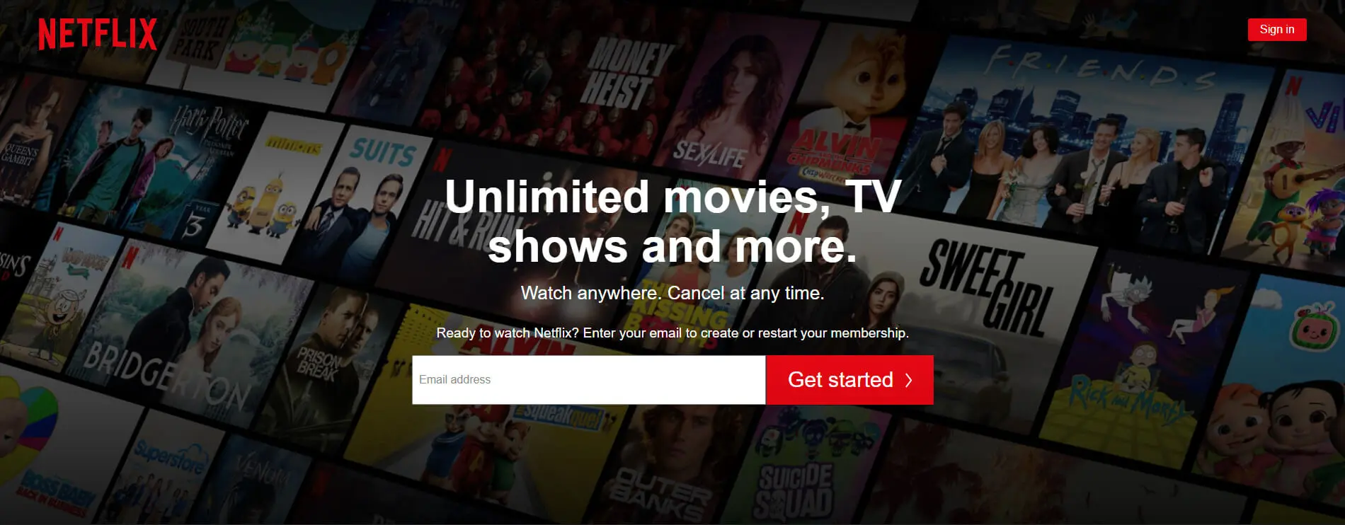
Along the lines of the “no-obligation” and “free trial” concepts discussed before, Netflix provides a one-month free trial, after which members can cancel their subscription anytime. Also, notice how the home page only consists of about 15 words. Yet, you know exactly what to expect — whether in terms of the payment structure or their services.
Incorporating CTA’s On Your Website
An excellent and compelling call to action is a sum of its parts.
At the same time, it is impossible to say which options convert the best — placement, action verbs, font colour, etc. And while you may take inspiration from others, beware of the downsides of social proof.
Don’t just mimic what works for others, as it may not suit your brand. Provided you have the traffic to run A/B tests, ensure you use all the tools available to diagnose underlying issues that may weaken your call-to-action.
Creating the perfect call-to-action relies on research and long weeks, or perhaps months, of tracking and tweaking. If it were easy, we’d all be rich.
So, try not to let the process get under your skin. Be patient, and let your target audience click and tap!


