Summary / TL;DR
The blog explores 12 famous logo designers and their enduring impact on brand identity, including Carolyn Davidson (Nike), Saul Bass (AT&T), Milton Glaser (I Love NY), Paul Rand (IBM), Paula Scher (Citibank), Rob Janoff (Apple), Alan Fletcher (V&A Museum), Lindon Leader (FedEx), Ruth Kedar (Google), Massimo Vignelli (American Airlines), Ivan Chermayeff (NBC), and Raymond Loewy (Shell). Each designer profile demonstrates the importance of simplicity, brand alignment, and scalability. The post also covers seven logo types, famous logo evolution examples, tips for becoming a successful logo designer, and a comprehensive FAQ section addressing common questions about iconic logos and their creators.
The saying “a picture is worth a thousand words” is an old formula graphic designers have sworn by!
Ask any logo designer, and they’ll tell you how a simple image or a handful of words can leave a lasting impression. It’s like a book cover; a logo can speak volumes about a brand, making it or breaking it.
Logo designers have the important task of bringing their client’s visions to life and shaping brand identity. They start with a simple idea, using creative illustrations and design principles to produce logos that are fresh, modern, and stand the test of time as timeless design.

In this guide, we will look at some of the famous logos and their designers worldwide, explore iconic logo designers and their best logo designs of all time, analyse what these logo artists got right, discuss what you must remember to be a successful designer and much more!
So, without further ado, let’s begin exploring the exciting world of design careers.
Famous Logo Designers at a Glance
| Carolyn Davidson | Nike Swoosh | 1971 | Abstract Mark |
| Saul Bass | AT&T Globe | 1969 | Abstract Mark |
| Milton Glaser | I Love NY | 1977 | Combination Mark |
| Paul Rand | IBM | 1972 | Monogram |
| Paula Scher | Citibank | 1998 | Logotype |
| Rob Janoff | Apple | 1977 | Pictorial Mark |
| Alan Fletcher | V&A Museum | 1989 | Logotype |
| Lindon Leader | FedEx | 1994 | Logotype |
| Ruth Kedar | 1999 | Logotype | |
| Massimo Vignelli | American Airlines | 1967 | Combination Mark |
| Ivan Chermayeff | NBC Peacock | 1986 | Pictorial Mark |
| Raymond Loewy | Shell | 1971 | Pictorial Mark |
World’s Most Famous Logo Designers & Iconic Graphic Design Masters
The 20th century was a landmark era for companies worldwide, with a growing focus on branding. As a result, designers were encouraged to create unique and emblematic logos with the right amount of visual appeal and style.
While social media was still far from the picture, print and other mass media industries thrived. Hence, companies needed to establish a connection with potential buyers through strong visual identity and brand recognition. The importance of graphic designers was felt more than ever, and several iconic names burst forth onto the scene.
Graphic design has blossomed into a celebrated art form, with modern designers often finding inspiration in legends like Carolyn Davidson, Paula Scher, and Milton Glaser. These globally recognised figures have reshaped the design world with their distinctive styles.
Given their abundant creative history, these iconic logo designers’ contributions to the design field have made a lasting impact on the graphic design scene, making them some of the best logo designers in the world. These logo artists are still admired worldwide for their skilful use of colours, style, and excellence in creating famous brand logos.
In this section, we’ll delve into the work of influential logo designers, explore their popular logos, and discover what made these famous brand logos stand the test of time.
Want to receive updates? Sign up to our newsletter
Each time a new blog is posted, you’ll receive a notification, it’s really that simple.
1. Carolyn Davidson
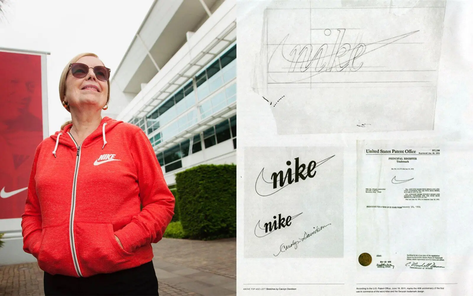
Carolyn Davidson designed the Nike swoosh logo in 1971 while pursuing her education at Portland State University. As an iconic American graphic designer and pioneering female logo artist, Davidson created what would become one of the most recognisable symbols in the world. She conceptualised the logo for just $35, crafting a design that perfectly embodies motion, speed, and victory.
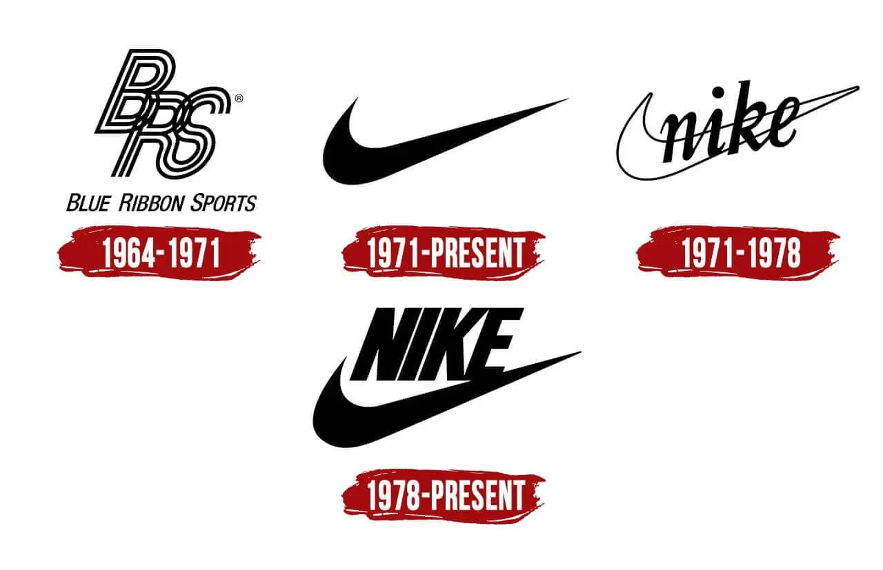
Initially, Nike founder Phil Knight was sceptical but chose the logo due to a lack of alternatives. Carolyn Davidson received just 35 dollars for her design. Despite this, she remained with Nike until her retirement in 2000. Later on, Knight showed his appreciation by gifting her a gold ring featuring the Nike logo. Inspired by the Greek goddess Nike, known for victory and strength, Davidson thought this symbolism suited the brand perfectly. A quick search for the Nike statue shows the resemblance to the swoosh, with arms outstretched like wings.
Although Phil Knight didn’t think the minimalistic design would work, it became an iconic logo with long-lasting appeal. Like the Apple logo, the Nike swoosh is universally recognised today, and the tick has also come to represent affirmation and positivity.
Carolyn Davidson understood the trick: the goal isn’t to make something extraordinary but to make minimalism look cool. It is to represent the brand in the most creative way possible.
The takeaway for future logo artists is clear: strive for eye-catching simplicity and a commitment to meeting deadlines to enhance your creativity. Combining these elements can give rise to iconic logos like the Nike swoosh; it will serve you well. Besides, great logos do not need text to back them up. If done right, they remain powerful on their own.
2. Saul Bass
Saul Bass designed the AT&T globe logo in 1969, along with iconic logos for Warner Bros, United Airlines, and Kleenex. As both a graphic designer and filmmaker, Bass revolutionised corporate identity design. His standout work for AT&T Services transformed the detailed bell symbol into a clean, scalable icon that could be used everywhere, from buildings and phone booths to advertisements and letterheads.
In 1969, Bass swapped the detailed bell symbol for a simpler design, crafting a scalable icon used everywhere, from buildings and phone booths to ads and letterheads. He even made a pitch video to highlight how the new design could be adapted to various sizes.
That’s not it! Saul Bass also designed the logo for Kleenex, Warner Bros and United Airlines. The common similarity in all these designs was their crisp and modern style, free of bells and whistles.
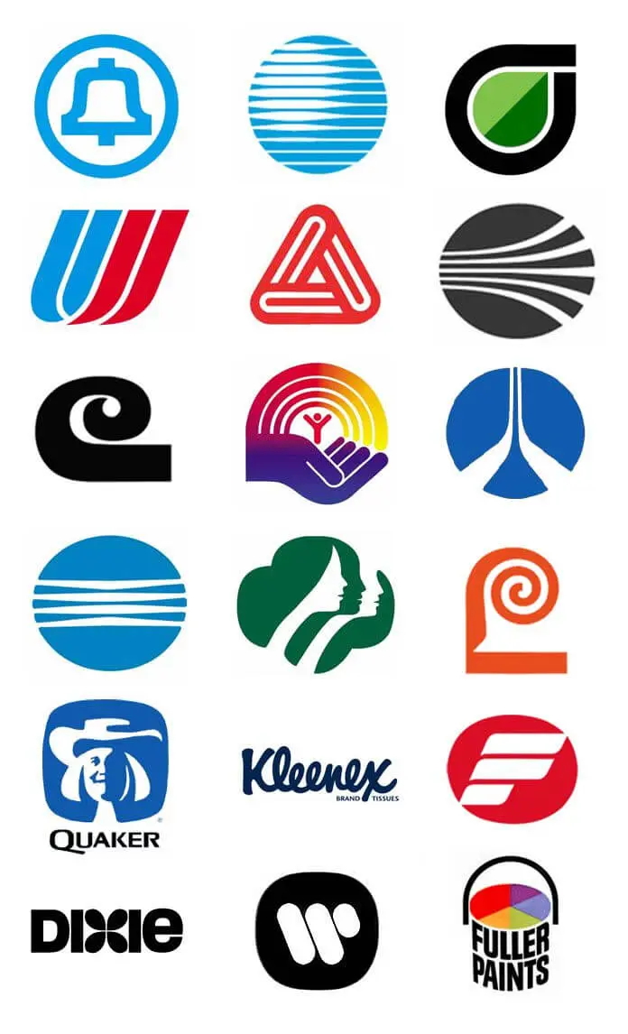
What was remarkable about these designs was Bass’s insight. Even in the pre-digital age, he had the ingenuity to create distinctive, clean layouts that could be scaled as per requirements. This principle has become one of the critical components of digital marketing campaigns today.
Saul Bass’ designs thus became synonymous with reliability, formed an immediate connection with the audience, and stood the test of time. Even with the advent of digital marketing, there was no need to redesign or upgrade the logos; they were thoughtfully designed, sophisticated, and solid enough to appeal to a contemporary audience.
Besides, although he used limited colours, the palette was vivid, with plenty of reds, blues, and blacks. Not to forget, he combined his choice of colours with extensive use of attractive typography, best exemplified by the soft curves of the Kleenex logo.
Thus, Bass proved contemporary logos didn’t have to be ornate to be eye-catching; simple curves, neat cuts, and adaptability can go a long way in establishing a brand’s identity.
3. Milton Glaser
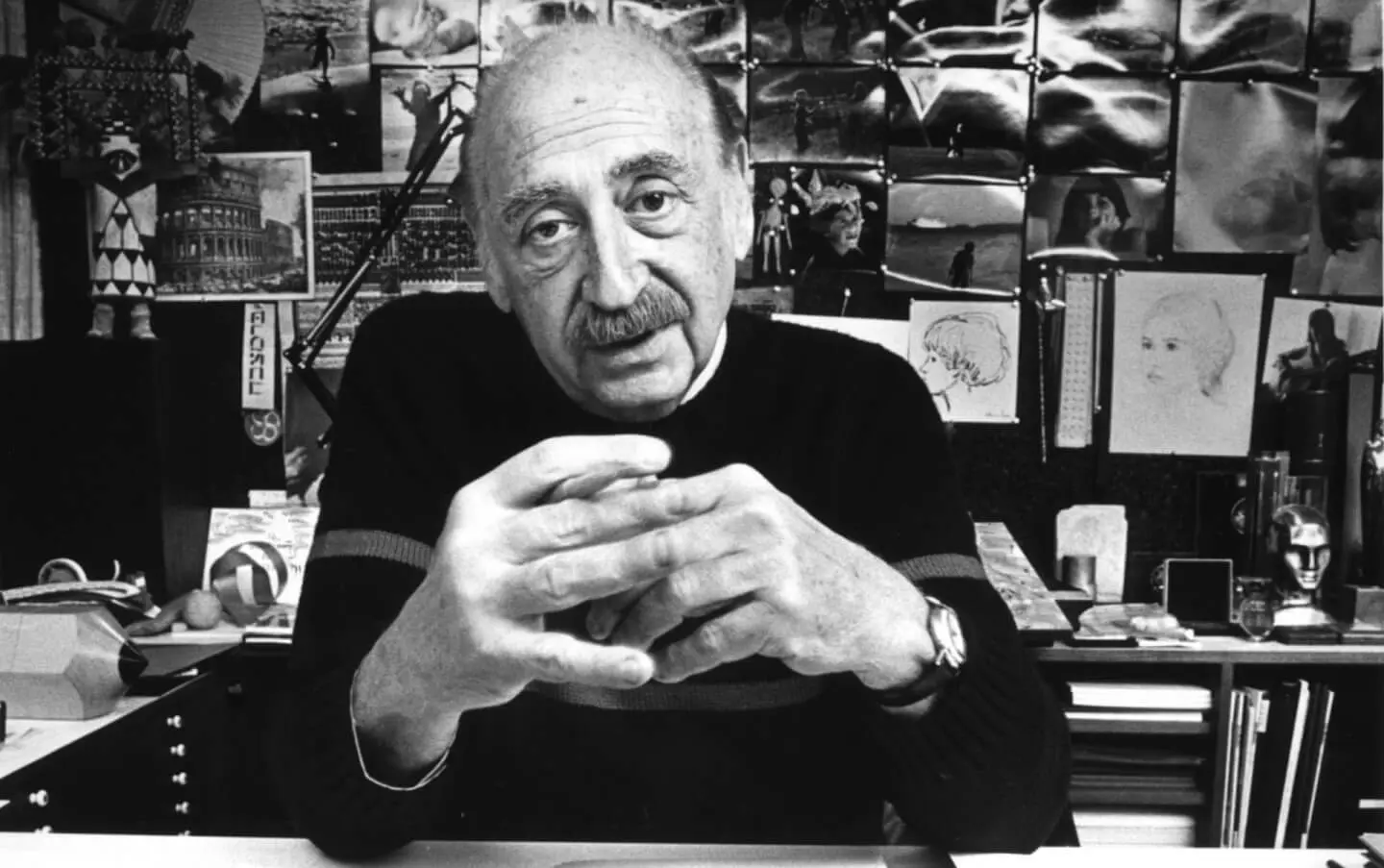
Multi-award-winning American graphic designer Milton Glaser’s work portfolio remains as prolific as his designs. He designed logos, illustrated film posters, and created brand identities throughout his decades-long career. Glaser co-founded Push Pin Studios in 1954 and later helped start New York Magazine in 1968, revolutionising editorial design.
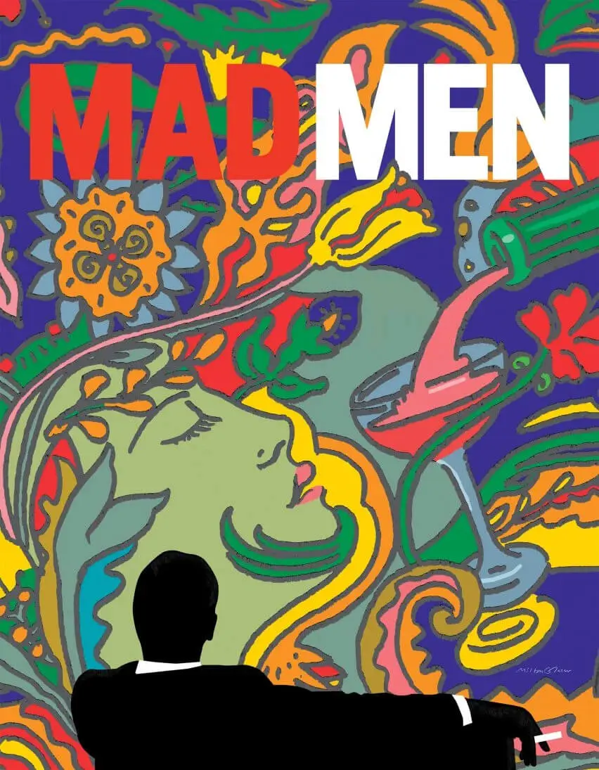
Perhaps his best-known work is the ‘I Love NY logo, designed in the mid-1970s to showcase New York in a favourable light after a series of crimes had impacted tourism in the city. The logo was well-received instantly and became the official state slogan. It continues to be a prominent part of pop culture, and its timeless appeal lies in its captivating design, simple font, and emotion-infused message.
This iconic emblem is found on New York billboards, trains, coffee mugs, T-shirts, and hats. Glaser couldn’t have done any better if the aim was to boost tourism. The logo became even more significant after the September 2001 attacks on the World Trade Centre.
Glaser struck a chord with American citizens, fuelling their patriotism and emotions and bridging the gap between a carefully structured marketing campaign and the city’s rich heritage. The bold red heart, the condensed message, and the innovation symbolised New York City’s spirit: one that is resilient and full of hope.
Milton Glaser also created the Brooklyn Brewery logo. The brand was earlier marketed as ‘Brooklyn Eagle Beer,’ but he changed the name to ‘Brooklyn Brewery,’ which their beers carry.

A vital lesson potential designers can take from Glaser is that it is imperative to ask questions, know about the brand’s history and imbibe its spirit. Use visual language and keep your work individualistic, but ensure that your work does justice to the company’s narrative.
4. Paul Rand
Paul Rand designed the IBM logo in 1972, along with iconic identities for UPS, ABC, and NeXT. Known for his no-frills approach to design, Rand became one of the most influential graphic designers of the 20th century. Besides being an accomplished logo artist, Paul Rand was also an influential art director and educator whose design philosophy continues to shape corporate identity today.
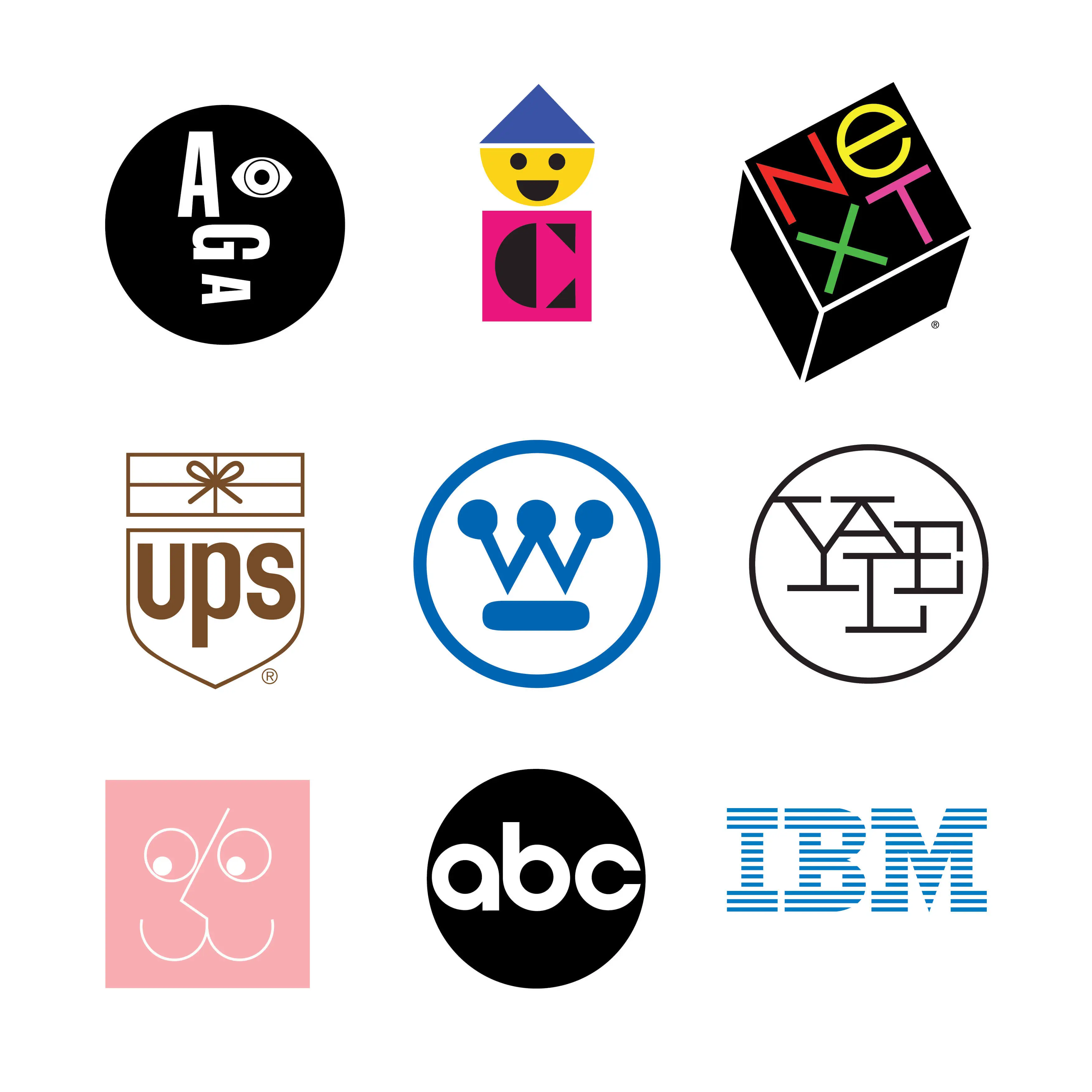
He firmly believed that for a logo to stand the test of time, it has to be designed with ‘utmost simplicity and restraint,’ There’s no better example of this than the IBM logo. Made of 8 horizontal stripes, it was a brilliant upgrade from the 1956 design but took over a decade to complete.
Paul Rand experimented with various fonts, sizes, and design elements to create a cohesive logo that best represented the brand’s dynamism. Long after formulating the new logo, he kept a close eye on its use and played an essential role in IBM’s branding.
Paul Rand and Tom Geismar collaborated with innovators like Steve Jobs on the logo of his computer and software development company, NeXT. We can learn patience from him: a solid logo doesn’t necessarily have to be born overnight. However, the focus should be on creating a robust and eye-catching logo that tells a story and represents the brand.
5. Paula Scher
Paula Scher has an impressive list of clients, including Citibank, Coca-Cola, Tiffany & Co, and Microsoft.
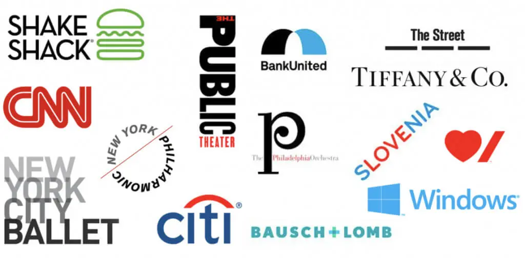
Although her career began as a record designer, working for CBS and Atlantic Records, she is today known for her significant contributions to the graphic design industry, including her work on Citibank’s brand identity and various Coca-Cola campaigns. The brands she worked with had a distinct appeal, with catchy names. Since drawings weren’t her strong suit, Scher used typography intensively to foster brand recognition.

Logotypes or font-based logos became her way of creating compelling designs, and she found it easier to represent the brand’s style through words.
6. Rob Janoff
Rob Janoff designed the Apple logo in 1977, creating what has become one of the most famous logos of all time. Apple struck gold when it recruited Janoff, who designed the iconic half-bitten, rainbow apple that replaced the original Newton illustration. The logo evolution from the original rainbow design to the current monochrome version demonstrates how timeless design principles allow logos to adapt while maintaining brand recognition.
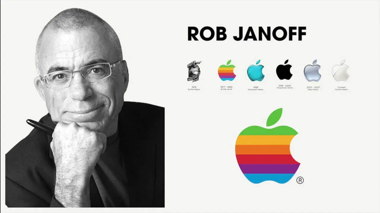
Janoff believed in keeping things simple because, according to him, people cannot remember complex images, but a half-bitten apple piques your curiosity, is instantly appealing, and memorable. Besides, it conveys the brand’s essence: user-friendly, reliable, and symbolic of all the knowledge consumers can ‘bite’ into.
7. Alan Fletcher
Any list of famous 20th-century graphic designers would be incomplete without Alan Fletcher. He used elaborate typography to bring his designs to life, as evidenced by his work for the Victoria & Albert Museum. He conveyed the museum’s historical importance with elegant black-and-white hues while ensuring the design remained timeless and functional.
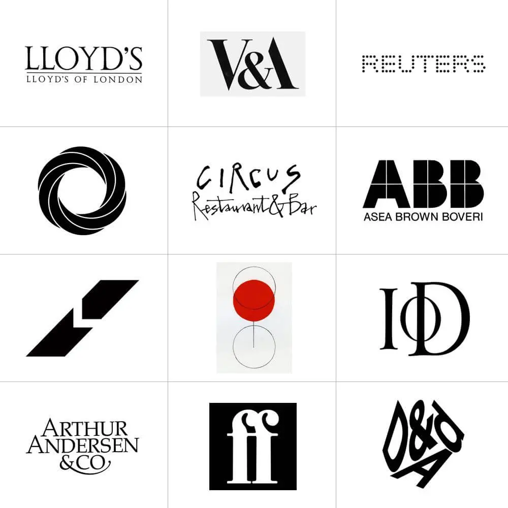
He also designed the international news agency Reuters logo in 1965, marked by the same ease of use and adaptability that characterised his earlier works.
Alan Fletcher, one of the most influential designers of all time, partnered with other notable graphic designers, including the founders of Chermayeff Geismar, to establish the design firm Pentagram in 1972. The company trained several top-notch logo designers who designed for firms like Rolls-Royce, Mercedes-Benz, Starbucks, and Verizon, where Michael Bierut’s Pentagram touch also made a mark.

8. Lindon Leader
Lindon Leader designed the FedEx logo in 1994, creating one of the most cleverly designed logos in corporate history. The hidden arrow between the ‘E’ and ‘x’ has become a legendary example of negative space design, symbolising speed and precision for the leading logistics and delivery brand.
Created by Lindon Leader in 1994, the FedEx emblem is among the best logo designs of all time. Including the white arrow between ‘E’ and ‘x’ is pretty clever and symbolises speed and precision, a hidden detail that has made it one of the most popular logos in corporate history.
The traditional colours of the FedEx logo were purple and orange, striking and creative choices that add tremendously to the branding. However, the company made slight modifications to its design where different colours were used for the ‘Ex’ portion of the logo, depending on the product type. For instance, it used yellow for trade networks and red for freight.

9. Ruth Kedar
Ruth Kedar designed the Google logo in 1999, creating one of the most viewed logos in digital history. Originally from Brazil and trained at Stanford University, Kedar was approached by Google co-founders Larry Page and Sergey Brin to develop their brand identity.
The Google logo went through numerous iterations before landing on the playful, multi-coloured wordmark we recognise today. Kedar experimented with various typefaces before settling on the Catull typeface, which was later modified into the custom Product Sans font Google uses now.
What makes the Google logo iconic is its deliberate breaking of design rules. The unconventional colour sequence (blue, red, yellow, blue, green, red) signals that Google doesn’t follow conventions, a perfect representation of the innovative company. The simplicity of the wordmark also ensures it loads quickly and remains legible at any size, essential for a digital-first brand.
10. Massimo Vignelli
Massimo Vignelli was an Italian designer whose modernist approach shaped corporate identity design for decades. His most famous works include the American Airlines logo and the New York City Subway map, both of which prioritised clarity and functionality.
Vignelli’s design philosophy centred on the belief that good design is timeless. He famously said, “If you can design one thing, you can design everything.” This holistic approach led him to work across furniture, packaging, signage, and brand identity with equal mastery.
The American Airlines logo, designed in 1967, featured a bold “AA” eagle symbol that remained in use for over 45 years. His New York Subway map, though controversial for its geographic inaccuracies, revolutionised transit design with its clean lines and intuitive colour coding. Vignelli’s legacy continues to influence logo artists who prioritise systematic thinking and visual consistency in their brand identity work.
11. Ivan Chermayeff
Ivan Chermayeff co-founded Chermayeff & Geismar (now Chermayeff & Geismar & Haviv), one of the most influential brand identity firms in history. His portfolio includes logos for NBC, National Geographic, Mobil, PBS, and Chase Bank, some of the most recognisable corporate symbols ever created.
The NBC peacock, designed in 1986, perfectly demonstrated Chermayeff’s ability to create meaningful symbolism. The colourful feathers represented NBC’s diverse programming while celebrating the transition to colour television. The Mobil logo’s distinctive red “o” became one of the most elegant examples of minimal differentiation in logo design.
Chermayeff believed that logos should be simple enough to work in any context yet distinctive enough to be immediately recognisable. His work with Tom Geismar established many principles that modern logo designers still follow, making their firm responsible for more Fortune 500 logos than any other design agency.
12. Raymond Loewy
Known as the “Father of Industrial Design,” Raymond Loewy shaped the visual identity of 20th-century America. His logo designs for Shell, BP, Exxon, Lucky Strike, and Nabisco demonstrate his remarkable range and his understanding of how visual identity drives brand perception.
Loewy’s MAYA principle (“Most Advanced Yet Acceptable”) guided his approach to logo design. He believed designs should push boundaries while remaining familiar enough for consumers to embrace. This philosophy is evident in his streamlined Shell logo, which simplified the original detailed illustration into the bold, recognisable emblem used today.
The Lucky Strike cigarette package redesign showcased Loewy’s commercial instincts: by moving the logo to both sides of the pack and changing the background from green to white, he created what became one of the most successful packaging redesigns in history. For aspiring logo designers, Loewy’s career demonstrates the importance of understanding both aesthetics and commercial impact when creating famous brand logos.
Types Of Logos A Graphic Designer Can Choose From
Choosing a creative and modern logo with stunning visual appeal for your company is challenging. As a graphic designer, you’ll have seven different options to choose from for logo design. Let’s take a look at what they are:
1. Monogram Logos
Also known as letter marks, this type of logo has letters, usually the company initials. Monograms allow you to form a connection between the brand name and its visual identity. For instance, Home Box Office is known as HBO, and the National Aeronautics and Space Administration acronym is NASA. Brands with long names use this type of logo since it gives them the necessary limelight without making it look very interesting.
Besides, as a graphic designer, you get to experiment with different font types and choose one that is readable and can be scaled down to business cards. Chanel, Gucci, Louis Vuitton, IBM ABC, a range that includes email address suppliers Gmail, etc., utilise monogram logos to represent their brands, and in their simplicity lies the appeal.
2. Logotypes
Another font-based logo, logotypes, or word marks solely focuses on the company’s name. Take, for instance, Google, Coca-Cola, Visa, etc. These companies have catchy and distinct names; logo designers must spell them out.
The focus here is on typography and visual identity. You can establish a strong corporate identity with a vivid colour palette and an attractive font style. Some brands opt for attractive calligraphy, while others (mostly fashion brands) keep it elegant to enhance brand recognition.
Let’s look at Google, for example. Although the font is minimalistic, bold colours stand for the company’s diverse range of products and the multiple results that pop up during a search. The combination of yellow, red, green, and blue looks vibrant and user-friendly, which is exactly what the search engine aims to be.
3. Pictorial Marks
Pictorial marks are graphic-based logos ideal for well-established popular businesses and do not need their names spelled out. Their logos symbolise the company, create a unique identity for the brand, and become almost more popular than it.
Let’s consider some of the most famous company logos: the Twitter bird, the Apple logo, the Snapchat ghost, the panda for WWF, and Target’s bullseye. All these popular logos are renowned worldwide; therefore, their brand marks are instantly recognisable.
Although this logo style works well for famous brands, we wouldn’t recommend it for new businesses still building their name.
Of course, one of the most significant considerations for any graphic designer is the choice of picture to be created. The image you use should convey the brand’s spirit and be memorable. It should be eye-catching and fun yet simple.
4. Abstract Logo Marks
Unlike pictorial marks that use distinct images, abstract logo marks use geometric patterns. Take, for example, the Nike swoosh, Pepsi’s circle, Adidas’ trefoil, etc. All these iconic logos have become famous brand logos thanks to the top logo designers in the world who saw great creative potential in them.
This type of logo stands out because it leaves room for multiple interpretations and thus allows customers to identify with your brand as they please.
The colours, powerful designs, and bold strokes allow you to convey what your company symbolises, but pictorial representations do not limit you. It gives your brand a distinctive style and a serious tone.
5. Mascots
Mascots are fun, creative logos that usually appeal to families and children. Mascots use an illustrated character, either a human figure or a cartoon.
They become the unofficial ambassador for your brand and create a connection between you and potential buyers. The Pillsbury Doughboy, KFC Colonel, and the Kool-Aid Man are famous mascots that add a special touch to the company and have an upbeat vibe. They are usually used for food enterprises, sports brands, etc.
The best part about mascots is that they are flexible and can adopt different expressions depending on what you want to convey. As a logo designer, your biggest challenge will be to make something friendly without making it look ludicrous. Customers should take your brand seriously, and the design shouldn’t be outlandish.
Besides, although mascots are great for social media campaigns, the logo rarely translates well on business cards. So, you might need to develop something more adaptable for your cards.
6. Combination Mark
If you are confused about the logo design that suits your brand, why not opt for the best of both worlds? Combination marks combine letters and pictures to create an appealing logo that speaks for itself.
Before moving on to anything else, consider iconic logos such as Burger King, Doritos, Dove, Lacoste, Jaguar, and Taco Bell. What do they all have in common? They combine font and graphics in one logo to convey a coherent message and what the brand is all about.
It leaves no room for confusion and is the best way to get people to associate a particular picture or mascot with your brand.
7. The Emblem
An emblem is a traditional logo design that has been around for decades. It includes text inside a symbol, like badges and crests. Given their vintage appeal, schools and government organisations often choose them for their branding.
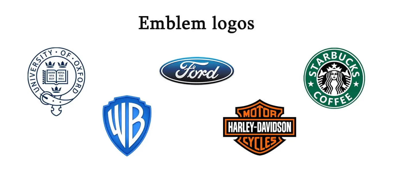
Some brands have added a modern twist to this design form and use it to convey a sense of prestige and longevity. Emblems are detailed and not quite versatile since they are difficult to adapt or replicate. However, this design is quite famous in beverage industries and private businesses since it has a unique style and gravitas.
Starbucks, Harley-Davidson, NRL, and various university press institutions are among the entities that use the emblem. Besides, this logo design is used for universities like Harvard, Princeton, and Dartmouth.
How To Be A Successful Logo Designer?
The one lesson you should learn from the world’s best logo designers of all time is that you must prioritise ingenuity while also focusing on simplicity. Your design should be attractive and fun, not uncomfortable and predictable.
Whether you aspire to be a famous logo artist or create iconic logo designs, here are the key points that logo designers need to keep in mind:
1. Keep The Design Simple
The logo designers we mentioned above created a unique identity for their clients’ brands while giving them a timeless appeal. Remember not to make your designs too confusing; too many colours, words, or figures can distract potential buyers and fail to convey the brand’s message.
Graphic design is a simple art form that doesn’t require bells and whistles. Decide on the type of design, pick a font style, and choose colours that best reflect your company’s nature.
Take iconic logos such as I Love New York or the Nike swoosh, simple designs that convey a powerful message and speak volumes for the brand’s nature without compromising style.
2. Know The Brand
As a logo designer, you need to have complete knowledge of the brand and its history and should be able to create a logo that aligns with it. The logo should represent the brand and what it offers. In addition, your logo should serve as an inspiration for future designers who work with the brand.
Your design should captivate and leave a reply in the mind of your audience. As a graphic designer, you must develop fresh concepts and innovative ways to draw the audience to your company.
3. Make It Adaptable
Make certain that your design is scalable to fit any corporate identity needs. Modern visual identity requires flexibility and easy adaptability. Your custom logo will be on billboards, business cards, pens, and posters.
Therefore, it should never look disproportionate. This design principle is essential for maintaining brand recognition across all platforms.
Graphic Design And Its Modern Relevance
An overview of the history of graphic design will tell you that typography and symbols have always been relevant.
Since the 1950s, logo designing has become more critical than ever, thanks to the growing emphasis on attractive marketing campaigns to draw customers. Unsurprisingly, graphic design has become a popular career choice today and is the first step toward building a brand image.
With technological advancement and the rise in competitors, it has become essential for any company to create an original logo with tremendous potential that breathes life into its digital marketing campaigns and brand identity.
Understanding logo history and how famous brand logos have evolved helps modern designers apply proven design principles to create lasting visual identity.
Your design should be contemporary, have a unique tone, and have a timeless appeal. Most importantly, it should profoundly influence the potential customer’s decision-making process.
That’s the focus of any graphic design firm: keep it simple, original, and creative!
Famous Logo Evolution: How Iconic Brands Redesigned Their Identity
Understanding how famous logos have evolved over time provides valuable insights for modern designers. The best logo designs of all time share a common trait: they can adapt to changing trends while maintaining brand recognition.
Apple Logo Evolution
The Apple logo has undergone significant transformation since 1976. The original logo, designed by Ronald Wayne, featured Isaac Newton under an apple tree. Rob Janoff replaced this with the rainbow-striped apple in 1977, symbolising the Apple II’s colour display capabilities. The logo evolved to a monochrome design in 1998, and the current sleek, minimalist version reflects Apple’s modern design philosophy while remaining instantly recognisable.
Pepsi Logo Evolution
Pepsi has redesigned its logo more than 10 times since 1898. The brand evolved from a simple red script to the iconic red, white, and blue globe. Each redesign reflected changing design trends, from the serif typography of the early 1900s to the minimalist “smile” design introduced in 2008. The logo evolution demonstrates how major brands balance heritage with modernisation.
Shell Logo Evolution
Raymond Loewy’s streamlined Shell logo (1971) transformed a detailed illustration into a bold symbol. The original 1900 logo was a realistic scallop shell sketch. Through progressive simplification over seven decades, it became the striking yellow and red emblem we know today. This logo evolution showcases how removing detail can increase brand recognition and scalability.
Google Logo Evolution
Google’s logo has evolved from a basic wordmark to a refined Product Sans typeface. Ruth Kedar’s 1999 design established the playful, multicoloured aesthetic that defied corporate design conventions. The 2015 redesign introduced a geometric sans-serif font optimised for digital displays, while the 2023 update added subtle gradient effects. Despite these changes, the iconic colour sequence remains unchanged, proving that consistent brand identity can coexist with modern updates.
Frequently Asked Questions About Famous Logo Designers
Who is the most famous logo designer?
Paul Rand is widely considered the most famous logo designer of all time. His iconic work includes the IBM, UPS, ABC, and NeXT logos. Rand’s philosophy of simplicity and timeless design has influenced generations of logo artists and brand identity designers worldwide.
Who designed the Nike logo?
Carolyn Davidson designed the Nike swoosh logo in 1971 while she was a graphic design student at Portland State University. She was paid just $35 for the design, which has since become one of the most recognisable logos in the world. Nike founder Phil Knight later gifted her a gold ring and company stock in appreciation.
Who designed the Apple logo?
Rob Janoff designed the iconic Apple logo in 1977. The rainbow-coloured, half-bitten apple design replaced the original Newton-based logo and has since evolved into the monochromatic version used today. Janoff’s design principles of simplicity and memorability made it one of the most famous brand logos globally.
What makes a logo designer famous?
Famous logo designers share several key traits: they create timeless designs that remain relevant for decades, they work with major brands that have global recognition, and they develop distinctive design philosophies that influence the industry. The best logo designers understand brand identity, master typography and visual language, and prioritise simplicity over complexity.
Who are the best logo designers of all time?
The best logo designers of all time include Paul Rand (IBM, UPS), Saul Bass (AT&T, United Airlines), Milton Glaser (I Love NY), Carolyn Davidson (Nike), Rob Janoff (Apple), Paula Scher (Citibank, Microsoft), Alan Fletcher (Reuters, V&A Museum), and Lindon Leader (FedEx). These iconic designers shaped the visual identity of some of the world’s most famous brands.
What is the most famous logo in the world?
The Nike swoosh and Apple logo are consistently ranked as the most famous logos in the world. Both logos demonstrate the power of minimalist design: they are instantly recognisable without any accompanying text. Other iconic logos include McDonald’s golden arches, Coca-Cola’s script, and the Google wordmark.
How much do famous logo designers charge?
Logo design costs vary significantly based on the designer’s reputation and the project scope. While Carolyn Davidson received just $35 for the Nike swoosh in 1971, top logo designers today can charge anywhere from $10,000 to $1,000,000+ for major corporate identity projects. Paul Rand famously charged Steve Jobs $100,000 for the NeXT logo, which included the stipulation that Jobs could not request revisions.
What tools do professional logo designers use?
Professional logo designers primarily use vector-based software such as Adobe Illustrator, which allows logos to be scaled to any size without losing quality. Many famous logo designers, including those from the pre-digital era like Saul Bass and Paul Rand, began their work with hand sketches before refining designs digitally. Modern logo artists also use Figma, Sketch, and Affinity Designer.

