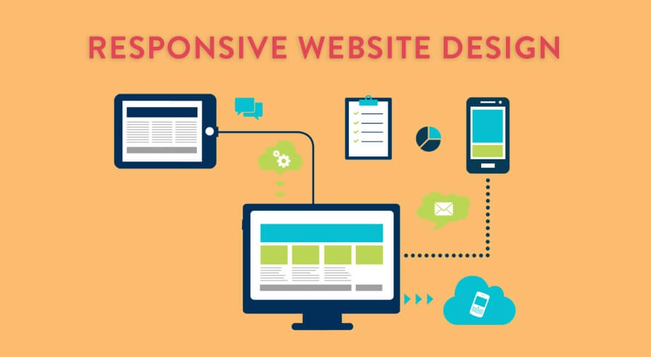
As technology shifts daily, the demand for responsive web design grows stronger. Keeping up with these changes is crucial for staying relevant.
Modern devices like tablets, phones, and smartwatches are now adapting to our lives and the accessibility we prefer.
It explicitly focuses on this gradual shift towards virtual shopping, social interaction, and other online activities such as virtual reality.
Data shows that 76% of all adults in the US shop online at least once a month, which is also the reason behind a rise in adaptive websites and e-stores that can be used on any platform.
“If your site is not mobile-friendly, there is a 40% chance your users will switch to a competitor website.”
Today, consumers want everything at their fingertips, accessible swiftly through laptops, PCs, smartphones, smartwatches, and tablets.
Not only this, but they’re operating from multiple devices, meaning more browser window sizes; many shoppers use more than one device to complete a transaction.
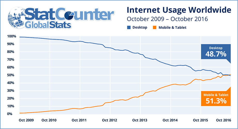
“ 51.3% of internet users worldwide operate mobile and tablets, whilst only 48.7% use desktops.“
Businesses keen on having a website are now prioritising mobile versions. Adaptive web design utilises CSS to ensure every site fits seamlessly on any device.
Creating a separate website for each device and screen resolution is practically impossible.
A responsive web design better fits the user experience and maximises the practical use of the interface without needing multiple sites or variations. It is important to design responsive experiences for mobile games, websites, or applications.
As of July 1, 2019, Google announced a rollout called “ Mobile-First Indexing,” which changed the industry altogether. Currently, Google ranks you based on your mobile site. If you’re not yet mobile, your chances are slim to none.
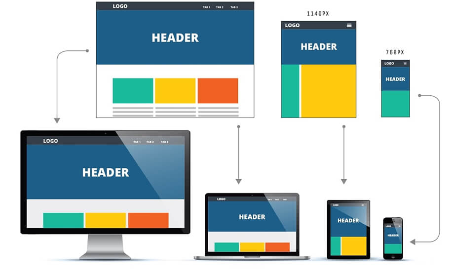
Each device runs seamlessly, allowing it to be smoother and more efficient. It benefits businesses by generating higher traffic levels on their website, especially if a version is available for mobile website design and tablet designs.
According to different platforms, creating and adjusting a website is known as responsive web design or CSS media queries.
What is responsive web design?
Responsive web design allows one design to be adaptive and respond seamlessly to the device and screen resolution by using fluid containers that contract and expand. This allows items and elements to self-position on a page “responsively “using CSS queries and HTML.
This allows designers to design one site that works across all products, making for better continuity and making developers’ lives much easier.
Your business website shouldn’t be held back by who can use it depending on their supportive brand of mobile or tablet-opening the market for potential new clients and better converting traffic.
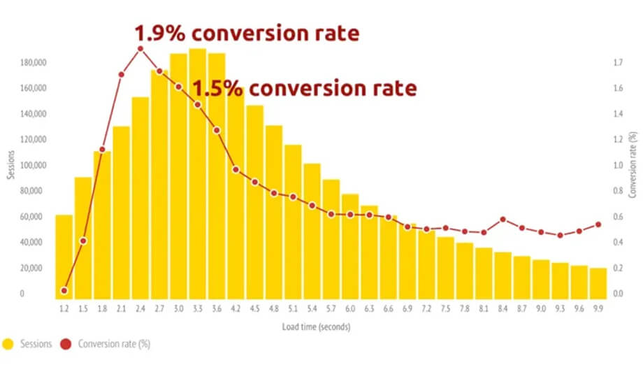
The trend continues as portable devices become more accessible, affordable, and reliable than traditional laptops or computers.
Companies like Google and Twitter have invested significant amounts of money in helping to advance how the Internet is used and how data is collected, as well as in helping develop frameworks such as the AMP Project and Twitter Bootstrap. HTML has also come a long way in supporting more mobile-friendly elements with HTML 5.
The Concept behind Responsive web design
Responsive web design layouts are an all-new way of designing and altering websites according to the user.
However, the site is not supposed to be coded and changed to fit the experience of each device and platform.
The modern approach ensures that responsive websites automatically adjust to different platforms, featuring fluid images and adaptable layouts.
Using media queries and scripts, your developer can adjust the HTML and CSS to transform web pages from one platform to another without coding or hassle.
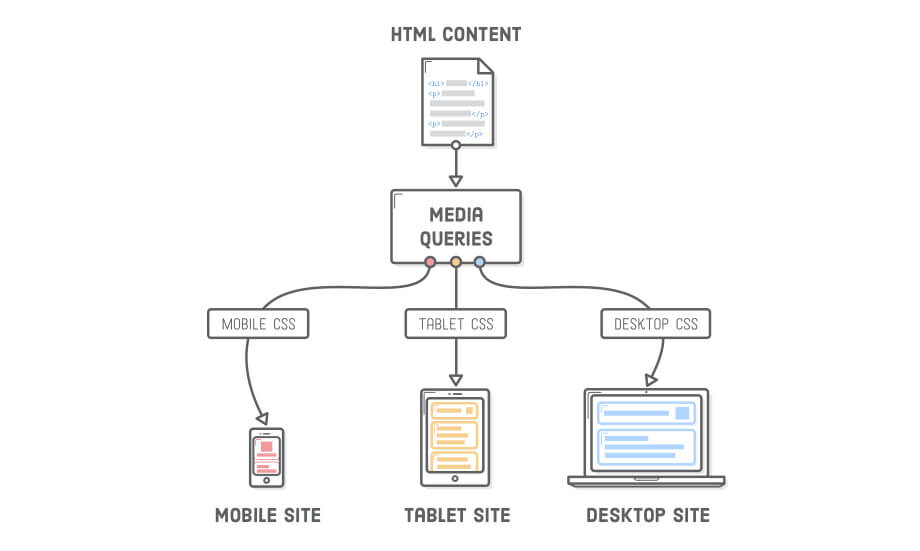
For example, here at sitecentre®, we ONLY code adaptive and fluid websites that work across all platforms, from mobile to desktop and tablet, even on your TV or smartwatch.
Using tools like the Google Mobile-Friendly Test or the Think with Google testing tool, you’ll better understand whether or not your site is responsive.
If it’s not, don’t waste time. Call us right now if it’s fantastic!
Adjust Screen Resolution
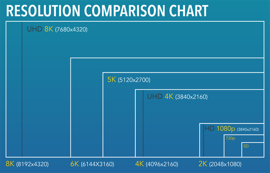
One of the main jobs of designing a mobile-friendly website is considering the various resolutions.
The web designer must consider screen size, layout, design, and website characteristics, noting small screens, large screens, and portrait and landscape devices.
Most web designers can intelligently use CSS media queries to create a flexible website for various platforms.
For the most part, a developer can use a framework like Bootstrap, Foundation, or Skeleton to streamline the development process and help build out the fundamentals of the core CSS.
There are a ton of varieties of screen sizes.
Our devices are ever-evolving, and brands release larger and smaller screens depending on the model and what is on trend; in addition, products are being released with high-resolution screens, which, in some cases, double and quadruple the pixels.
Having a flexible Layout
A flexible design can help provide that extra satisfaction to your user.
This includes flexible images and videos that load to the perfect size, flexible structural elements, and designs.
So, your images and videos should be scalable, whether for a large screen, a smaller device, or a combination of both.
A shift in orientation can stretch, pixelate, and dismember your content.

Such fluid images also help with platforms that switch in orientation; for example, phones and other mobile devices can switch from portrait to landscape based on how you hold them; this can be done using JavaScript or CSS.
Steve Jobs may have had it wrong in 2010 when he famously stated:
“You can’t get your hands around it. No one’s going to buy that“
This refers to large-format phones and tablets that have a larger browser width. Yet, mobile phones keep getting larger, which means responsive design is forever growing.
The code below illustrates how layouts vary and may change depending on the devices.
This can also happen if the screen sizes rapidly change, as well as changes in font size, flexible images, headers, and more.
See the Pen 3 Column Responsive Layout by Graham Clark ( @Cheesetoast) on CodePen.
Such designs are made up of fluid grids. Let’s find out more about fluid images and how they are created.
Flexible and Fluid images
Using flexible or fluid images can make or break your website’s performance, whether from a speed or conversion standpoint.
Previously only used by large businesses and top developers, this technology has become easy to understand and implement into your site to improve your visitor’s experience.
Web designers can create fluid grids, commonly known as columns, for responsive web design and images with these methods:
- Hiding and/or revealing the image portion (background and foreground images)
- Creating side composite images
- Foreground images that scale with the layout, where height values are not necessary. Image scaling can be scaled with JavaScript.
The aim is to create elastic layouts. Creators can use simple techniques to resize images, and most modern browsers automatically resize them.
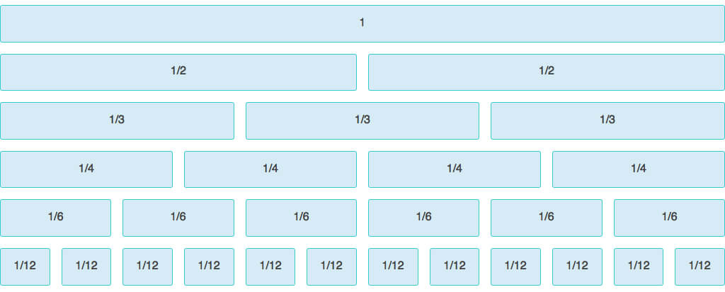
Most designers use CSS to guide the relative size, but similar results can also be obtained by utilising HTML5 and JS.
It is important to size them ideally using a column system. If made too small, the image can be of low quality when opened on different platforms. It should be visible on the desktop and smaller screens.
There are many ways to implement responsive images; CSS-Tricks has a fantastic article on doing this.
Media Queries
CSS3 can support many media types, and it can also have many kinds of media features, which include:
- Correcting the orientation
- Altering colours
- Changes according to the height of devices
- Setting the maximum width
Older devices do not support CSS3; however, it is a great way to target the newer devices that, like iPads and other Android devices, can support such media features that can come in handy when web designing.
CSS3 Media Queries and Breakpoints offer multiple stylesheets, allowing web designers to use various media queries and display them on a single stylesheet!
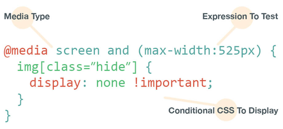
This method is super convenient for a responsive web design principle.
However, this does not limit web designers to using single-style sheets. They can also use separate stylesheets for separate queries depending on the type of device, although this can impact performance.
One of the great features CSS3 offers is the minimum title and maximum width. This allows web pages to adjust to different browsers and screen widths.
This makes the process easier for the user and adjusts the website accordingly.
If you were to create separate stylesheets, the website would have to call each stylesheet file every time the user switched orientations!
Tools to test out responsive web design
Whether a local dentist, an international blog, or a small eCommerce store, your website is no matter. It is important to test whether your site is device-friendly.
There are many online tools where you can add your URL to determine whether your layout is mobile-friendly or compatible with a specific device or resolution.
A mobile-friendly test offers a similar service. You can use your website URL to determine how well it responds to mobile devices and other smartphones.
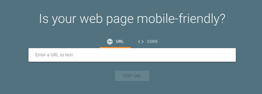
Think with Google, which is a platform that allows website designers and creators to test the speed of their web page loads and adjust them to a specific device. It can even measure mobile device speed and responsiveness!
In addition, the responsive tool allows you to test out the web design for multiple platforms.
This can include tablets, smartphones, smart TVs, laptops, and more. Testing responsive web design is crucial to retaining traffic.
In addition, if your site is not adaptive to various devices, it can take a toll on visitors and how quickly they might click away from the web page.
Frameworks
A framework opens a library that allows for more accessible web design using cascading style sheets. Two of the most popular frameworks are Bootstrap and Foundation.

Here, we give a little insight into some of the most used responsive web design frameworks to help users create exceptional websites using columns to control media queries and breakpoints.
They offer responsive web design templates, as well.
A Bootstrap responsive website has a proper layout for each device and comes complete with all the tools needed to get started for free. Designers can experiment with many more customisations and fluid layouts, and there are plenty of resources online.
There are features of bootstrap responsive layout designs, which include:
- Navigation
- Call-To-Actions
- Dashboard and Fluid Layouts
- Contents section
- Icon Sets
- Adaptive Images, iFrames, and Videos
- Image Galleries
Bootstrap offers unrivalled features, one of which is its founders Twitter, navigation element, and helpful features.
It also acts as startup documentation that many new web designers can refer to when starting a responsive web development job.
The good thing about Bootstrap is that it can also be easily viewed on different mobile devices.
Similarly, another framework is the Foundation. This is an exceptional front-end framework.
It has endless design options and desktop and mobile device templates for layout applications.
It offers many layouts, including navigation, media, and more! Developers can choose and experiment with the framework according to the client’s needs.
Both offer a fantastic range of features and are comparable in structure. Templatetoaster has a great article comparing them.
Useful Media Feature
If you want to make any website responsive, use breakpoints or media queries to break up browsers into more manageable resolutions.
Many useful CSS Media Query features can help with multiple web features.
Aspect Ratio
It can help with the title and title ratio of the viewport, which differs from landscape to portrait. The table below illustrates how:
/* Exact aspect ratio */
>@media (aspect-ratio: 2/1){}
/* Minimum aspect ratio */@media (min-aspect-ratio: 16/9) {}
/* Maximum aspect ratio */@media (max-aspect-ratio: 8/5) {}
Orientation
The most useful media query feature is its ability to help with orientation.
The landscape orientation has a height greater than the width. Meanwhile, the portrait orientation has a height greater than or equal to the screen width.
/* landscape styles */@media (orientation: landscape) {}
/* portrait styles */@media (orientation: portrait) {}
It helps web designers create a more responsive and adaptive web design. To give the end-user the most satisfying experience.
Display mode
This feature can help out in testing responsive design. The display mode feature helps test the display mode of a particular page or application.
The feature query can apply whether or not a web app manifest exists.
Width and Height
These features are essential to creating a responsive code. It is important to screen resolutions to help the designer set the min-width, maximum height, and other features that create an adaptive experience.
/* Exact Height */@media (width: 360px) {}
/* Maximum Height */@media (max width: 768px) {}
/* Minimum Height */@media (min-width: 992px) {}
/* Exact Height */@media (height: 360px) {}
/* Minimum Height */@media (min-height: 640px) {}
/* Maximum Height */@media (max-height: 768px) {}
Prefer colour scheme
Many newer devices can shift the colour scheme to dark mode and use media queries to make this job more manageable.
It can help detect whether or not the user wants a dark or light scheme.
It can be added if the API is not available.
CSS3 & HTML5 Responsive
CSS and HTML5 are the markup languages that help decide your page layout and how the content is displayed.
These are the core elements towards creating a website that is device-friendly and suited to all types of orientations using HTML and CSS.
There are many templates available online for responsive HTML5 layouts.
Many agencies offer templates that are compatible with Bootstrap.
Although here at sitecentre®, we don’t use templates, we custom-develop each website; we see templates as a great entry-level foundation for small businesses.
Mobile-First Indexing
Mobile-first indexing means that Google uses mobile versions of websites and platforms for their rankings.
As our generation gets tech-savvy, a large influx of people uses mobile devices to access the internet.
This is why using mobile phone users in data collection is more accurate.
Google prefers mobile websites to curate results and rankings.
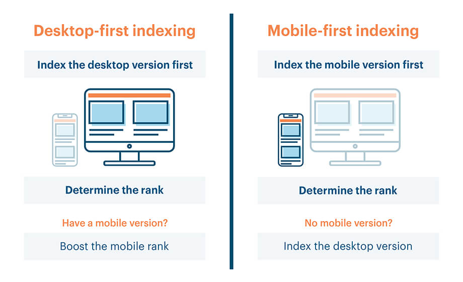
Desktop versions have outdated data traffic and do not help optimise content, given that the larger demographic now resonates on portable devices and their browser window.
Indexing allows Google Bot to scram through index pages with the help of the smartphone agent. The latest rankings are created according to best practices with HTML and CSS for your responsive web design project.
For example, if your website has mobile phone-optimised content or has the same content as your desktop website and the same structure that fulfils excellent practices criteria.
These practices are designed in a way that helps websites seek higher rankings and generate more traffic to their website.
Mobile Speed Performance
A fluid design is excellent; however, a well-optimised website that loads quickly on devices using cellular or mobile data is essential to any responsive web design.
This can depend on optimising your images, whether they adjust appropriately to different devices, and how assets like CSS and JS are loaded.
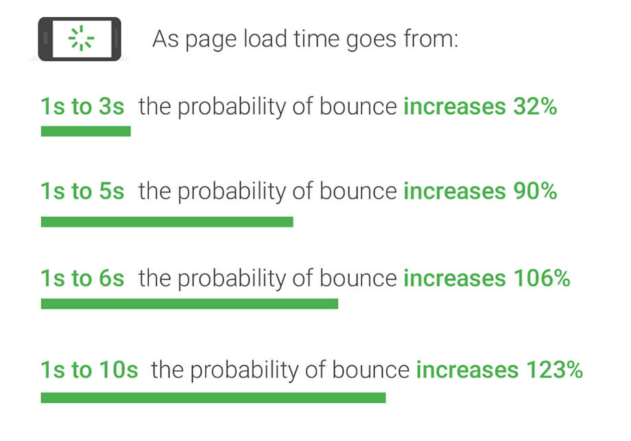
Speed of how fast pages download on smaller devices as compared to desktops.
In addition, other factors like caching, minification, and clean coding can contribute to faster mobile performance.
There are also online tools that can help you identify whether or not your mobile loading speed is within a specific limit that you would prefer.
You could also opt for a hosting site that offers quality services to help manage data traffic and how fast the web page loads.
Otherwise, you might have people click off within the first 10 seconds of the screen and not load as fast.
Designing for Responsive Web Design
For any web designer, creating content and structure is extremely important.
Especially if the content is to create an adaptive and responsive website inevitably, the major goal, after all, is to create a device-friendly web page.

The information architecture, including the page’s layout and structure, has been defined. The next step is to add design elements to make the website look responsive across all devices.
It is also important to create a structure based on the content rather than the reverse!
This methodology works for most people, whether it’s a narrow or a wide viewport.
Start your design
It’s the 1st order of business to identify the content you need and then estimate and figure out the information architecture.
Creating a skeleton view of a page is better for a narrow or wide viewport.
After creating a road map of pages, adding the content to adjust positions and sections is good.
From now on, the site can be built around the content.
Features like the headline can be added to make the interface even better. Another website features components like forms that collect the visitor’s information-known as a user form- with name, email, addresses, Phone numbers, and all kinds of information.
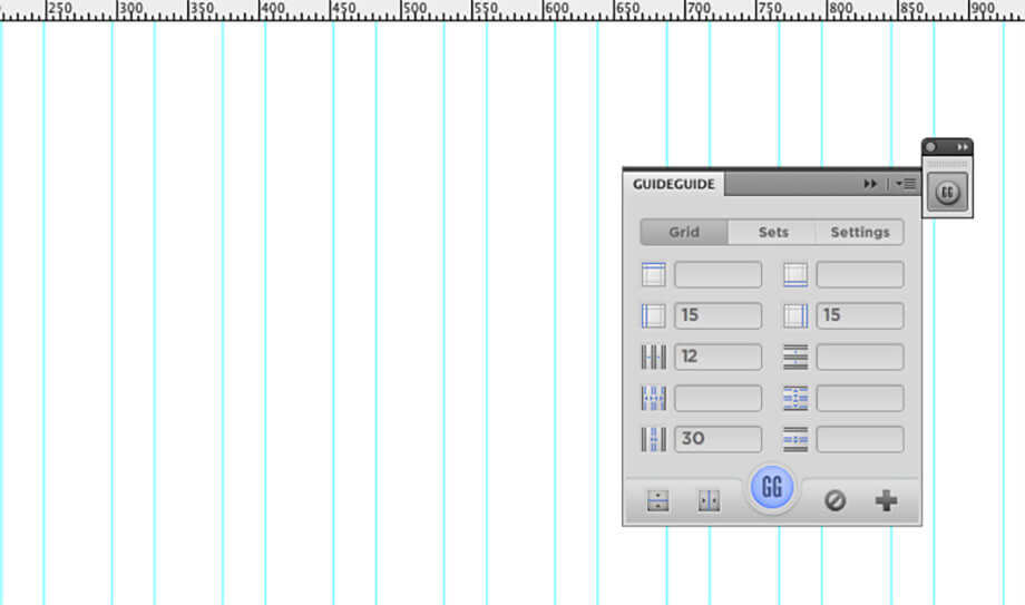
Starting with a PSD template can make your job much easier, with the grid, guidelines, padding, and all added for you so your design elements fit within the container’s restraints.
- Bootstrap 4 Grid PSD
- Foundation Grid PSD
Conclusion
The world is changing, and devices are getting bigger, changing shape and ever-evolving.
As an industry-recognized company, we stay at the forefront and set the foundation for those to follow. We must keep up with each new language design principle and ensure our customers and their websites are compatible with the most extensive devices.
Mobiles are addictive; see the image below, which people would give up instead of losing their phones.
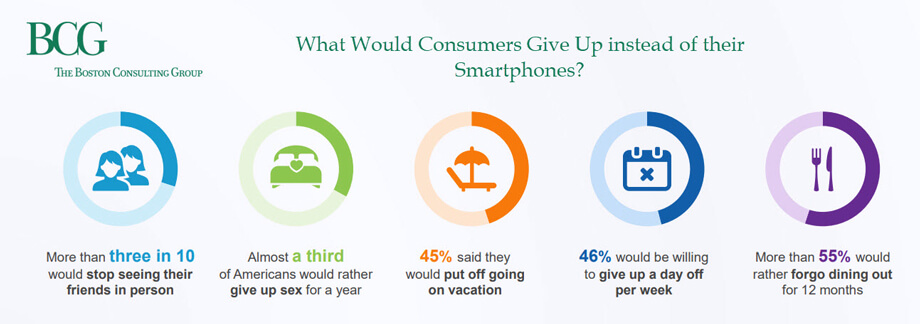
Responsive design isn’t going anywhere; it is also evolving and becoming more powerful.
Now is not too late if you’re yet to dive into some fluid or adaptive design.
If you’re not mobile-friendly, your business will suffer, your traffic will fall, and you will fall behind your competition.
There are so many entry levels, from low to high, that there is no reason you should be mobile-compatible.
At sitecentre®, we specialise in building responsive web pages optimised for any device width, from desktops to mobile phones. Our web design experts craft responsive layouts using a media query and responsive images to dynamically adapt your web page layout, text size, and images to match your visitor's browser window width.
We leverage the viewport meta tag to control viewport width and enable smooth scaling on mobile devices, and use max-width CSS properties to constrain content on wider browser widths. Our responsive web pages reformat on the fly to provide an optimal viewing and interaction experience tailored to your visitors' browsers. With a website from sitecentre®, you can trust you'll have a fully responsive web page design that looks fantastic on screens of all sizes.